We want you to tell us about your project.
Tell us what you need and we will contact you as soon as possible.
Embrace Darkness
Step Into the Light
Cuéntanos qué necesitas y nos pondremos en contacto contigo lo antes posible.
|
|
Leer
?
Play

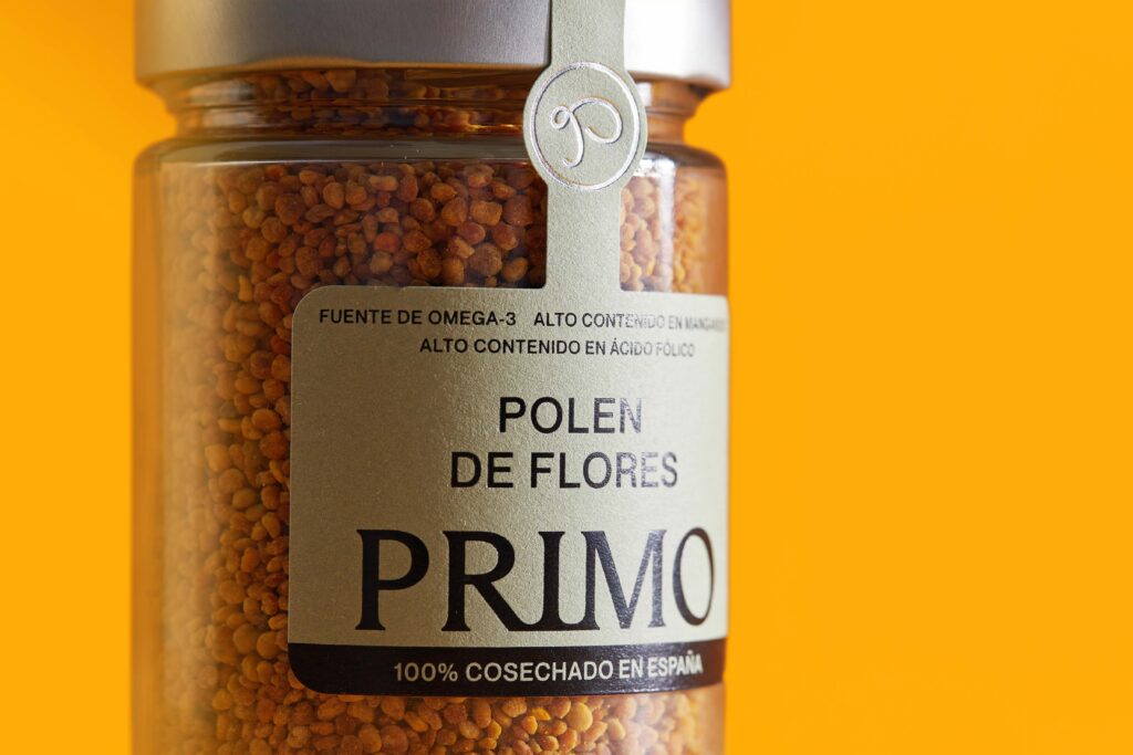
Primo Mendoza SL had been part of the honey industry for more than 100 years. A family-owned company with a strong legacy, solid industrial capabilities, and more than 150 products on the market. Over time, the company had developed 8 active brands disconnected from one another. None of them carried the company’s name, and none managed to reflect the strength, expertise, and value behind the business.
The problem was not the quality of the product. The challenge was building a solid brand architecture.
The result? A situation common in companies that grow for years without a global brand strategy: confusion. Confusion on shelf and confusion for consumers. That’s why, before designing anything, we started by understanding.
PHASE 1 — Understanding the business from within
During the strategic process, we interviewed management, middle managers, national and international sales teams, production, logistics, marketing, and ecommerce departments. We wanted to understand how the different brands coexisted, how they were being managed, and what perception existed both inside and outside the company.
And that’s where something important emerged: the company had enormous value. Tradition, product expertise, innovation… But none of it was being communicated in a coherent way.
PHASE 2 — Analyzing the market and identifying the opportunity
Looking beyond the honey category, we analyzed competitors and brands from other sectors to understand how companies build recognition and visual order on shelf. The conclusion was clear: most brands were competing through product alone, while very few were building a strong brand capable of generating real recognition.
We identified a clear opportunity: positioning the company through closeness, trust, and product expertise. But to achieve that, simplification was essential.
PHASE 3 — Making a strategic decision
And the answer had been right in front of us all along: PRIMO.
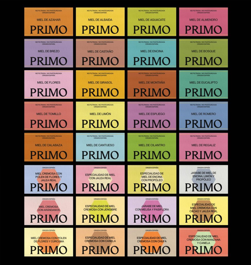
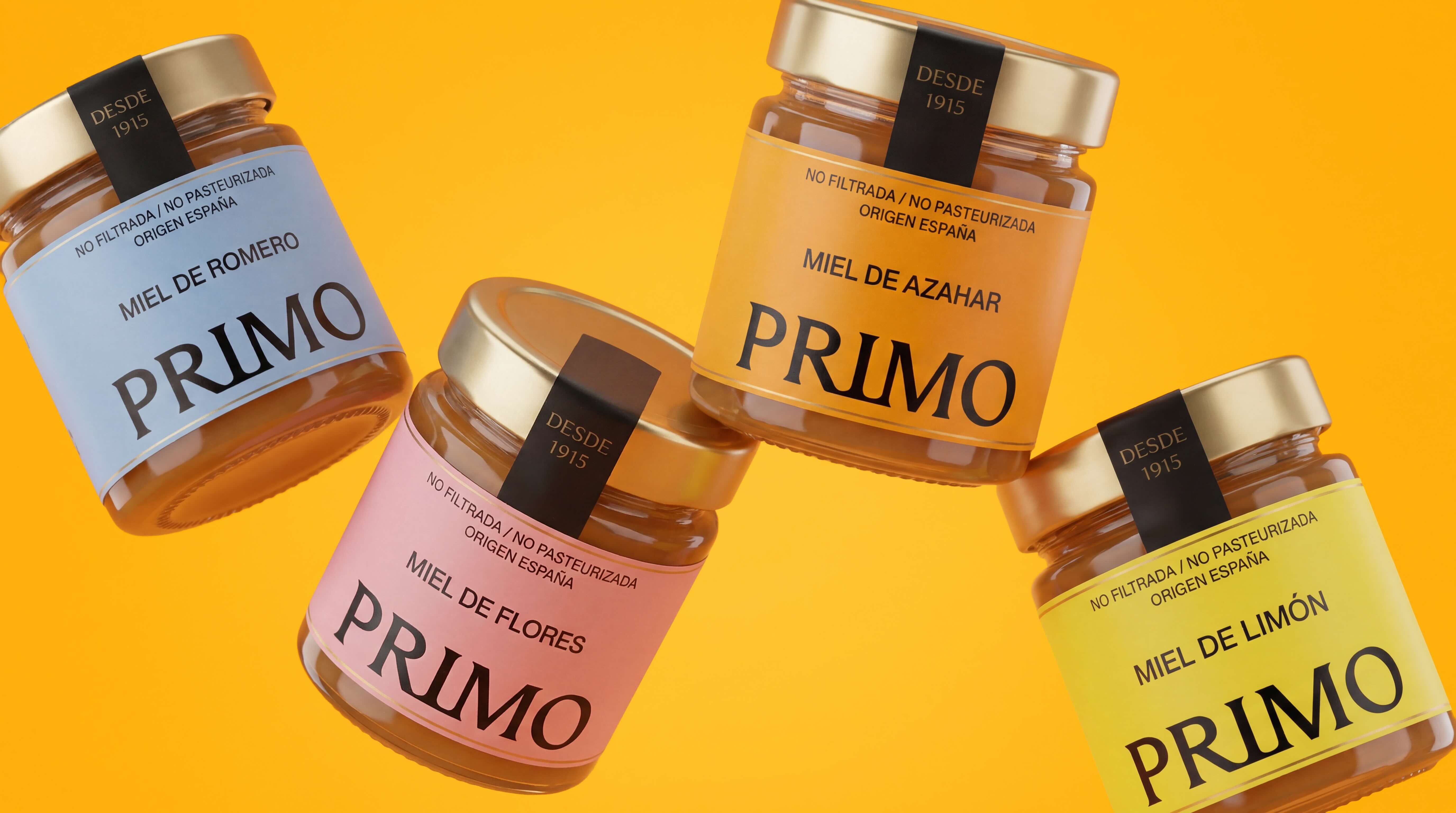
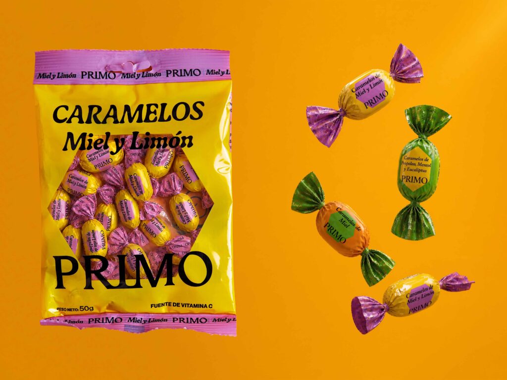
The strategic decision was to turn the company name into an umbrella brand capable of unifying every product family under one single system. A brand designed to organize, simplify, strengthen shelf presence, and prepare the business for coherent future growth.
From this new architecture, we built the entire brand positioning: a close, reliable identity designed to guide and support consumers.
PAHSE 4 — Building a system designed to grow
The result was an organized, coherent, recognizable packaging system built to scale. From 8 disconnected brands and more than 150 scattered products to one unified identity with a clear structure, defined positioning, and a much stronger long-term vision.
Based on this new architecture, we defined the complete brand strategy: from positioning and personality to territory, tone, and voice. PRIMO was built around the caregiver archetype, consolidating itself as a close, trustworthy brand designed to guide consumers toward more conscious habits.
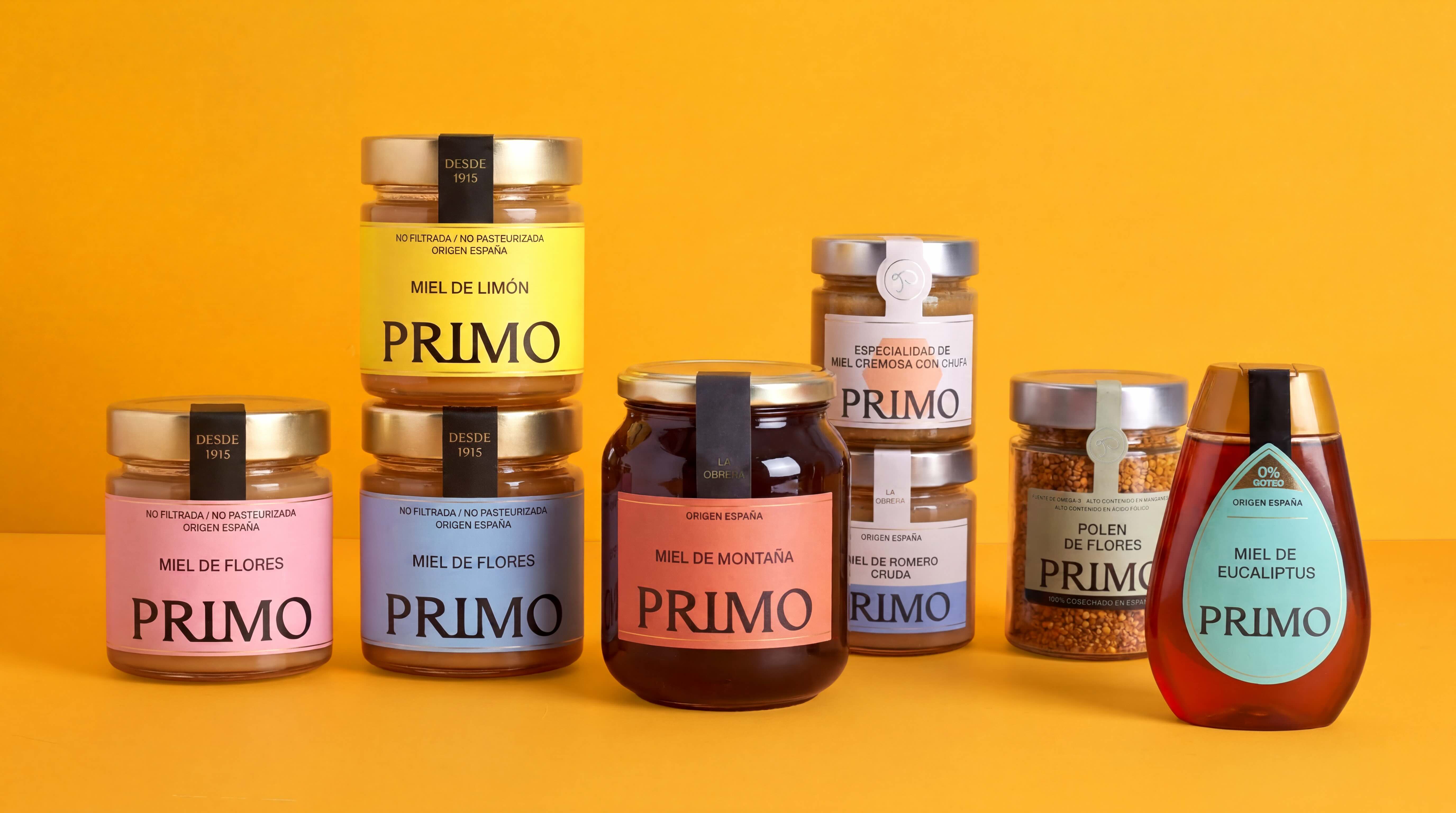

From 8 disconnected brands and 150 scattered products to a true brand architecture with a clear structure, defined positioning, market recognition, and real scalability.
Tell us what you need and we will contact you as soon as possible.