We want you to tell us about your project.
Tell us what you need and we will contact you as soon as possible.
Embrace Darkness
Step Into the Light
Cuéntanos qué necesitas y nos pondremos en contacto contigo lo antes posible.
|
|
Leer
?
Play
For years, Café Barsel had built a strong reputation within the coffee industry. However, the brand perception did not reflect the true value behind its product. Despite more than 25 years of experience selecting, roasting and distributing coffee, the brand was still perceived as a basic and conventional option. A familiar presence in countless cafés and bars, yet disconnected from the codes and expectations associated with quality coffee.
The challenge was not to make Café Barsel look like a different brand, but to communicate what it had always been. Before designing anything, we developed a repositioning strategy focused on redefining the perceived value of the brand while preserving its history and expertise.
The decision was clear: we moved the brand away from the territory of generic coffee, but also from the more exclusive codes often associated with specialty coffee. Instead, we positioned it within a space defined by coffee culture, expertise and experience. Rather than adopting temporary trends or industry clichés, we chose to highlight what had always made the brand unique: its heritage, its deep knowledge of coffee and the trust it had built over decades.
Based on this strategy, we developed a new brand territory inspired by the Creator archetype. A vision of coffee where sourcing, roasting and brewing are all part of the same creative process. A process in which every participant — from producer to consumer — plays a role in shaping the final coffee experience.
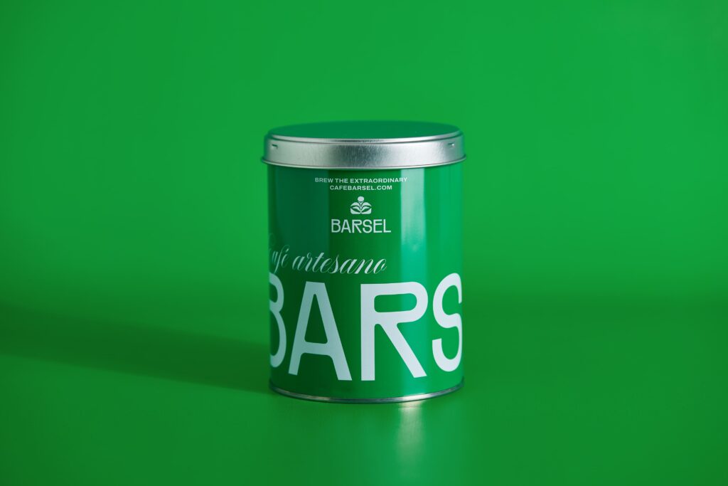
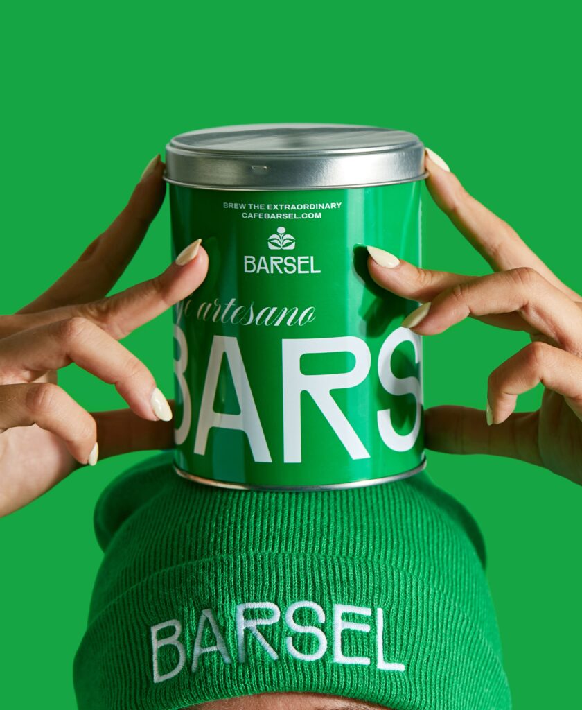
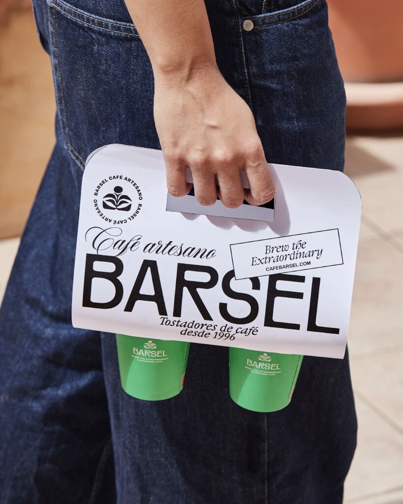
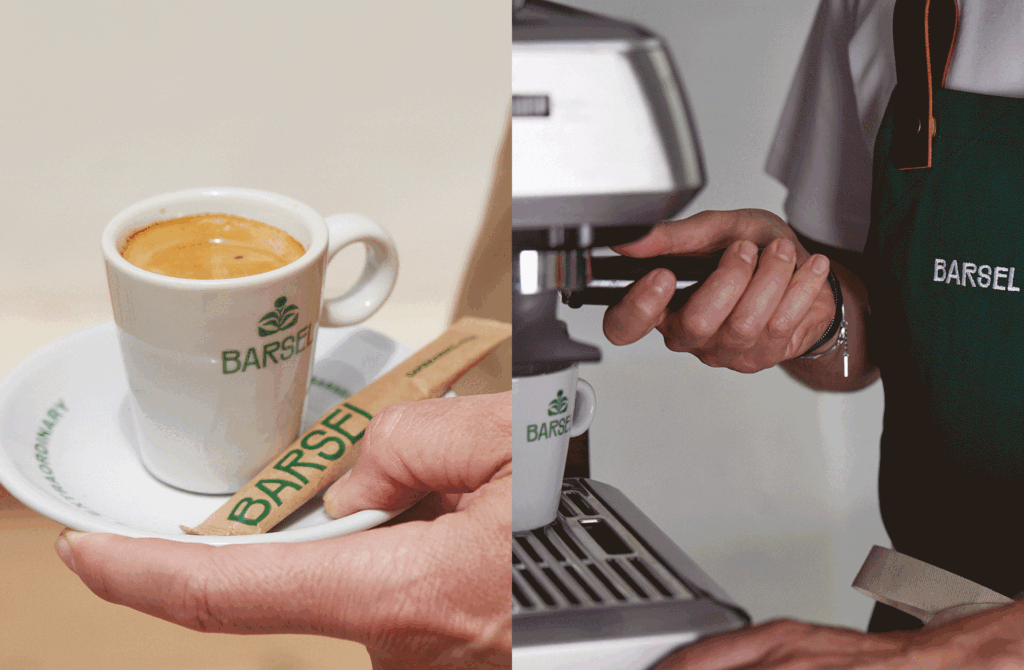
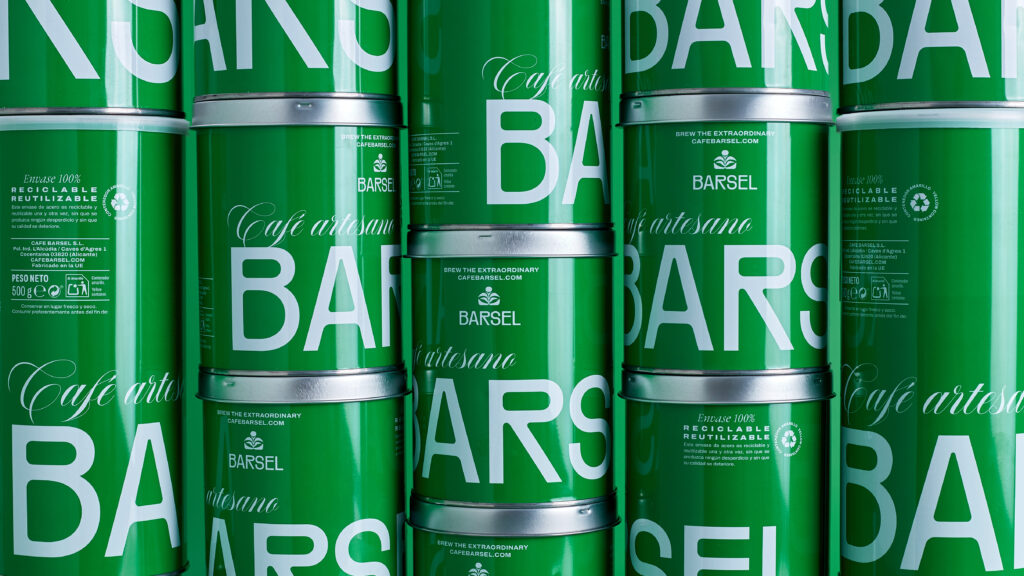
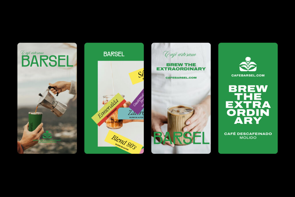
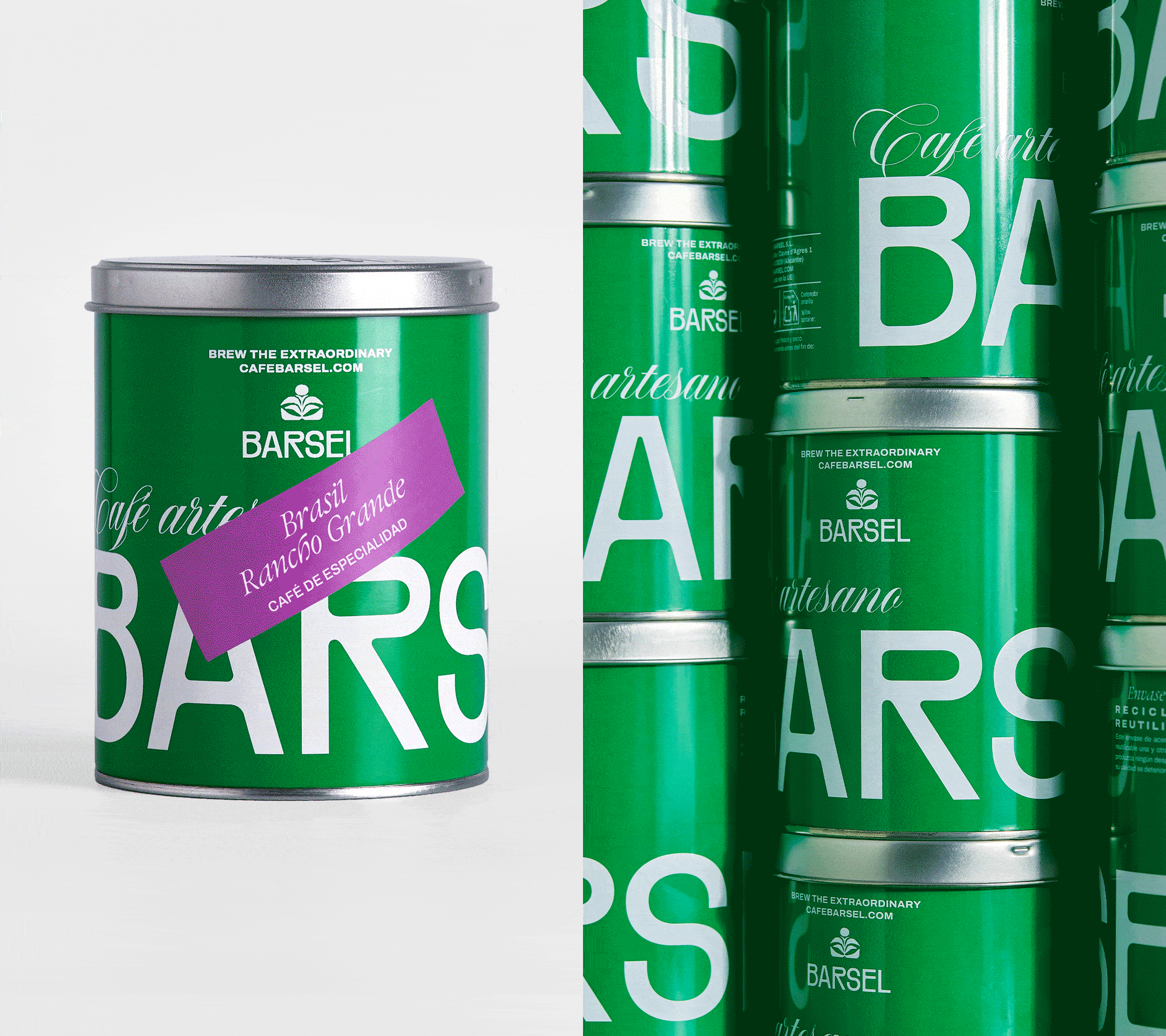
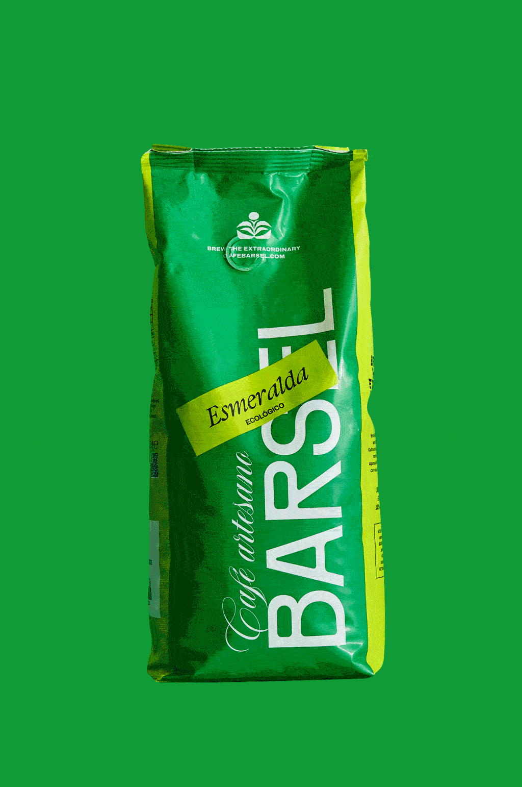
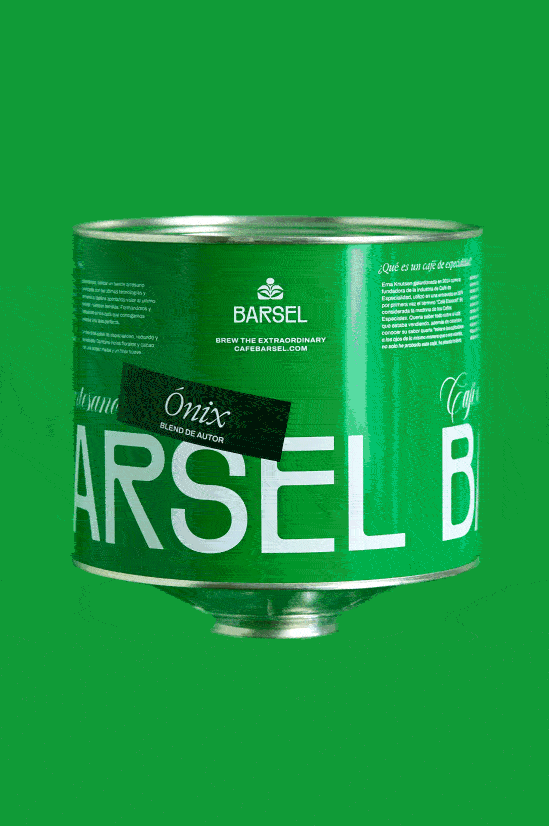
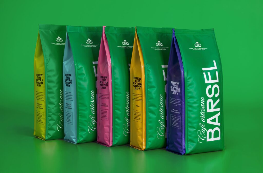
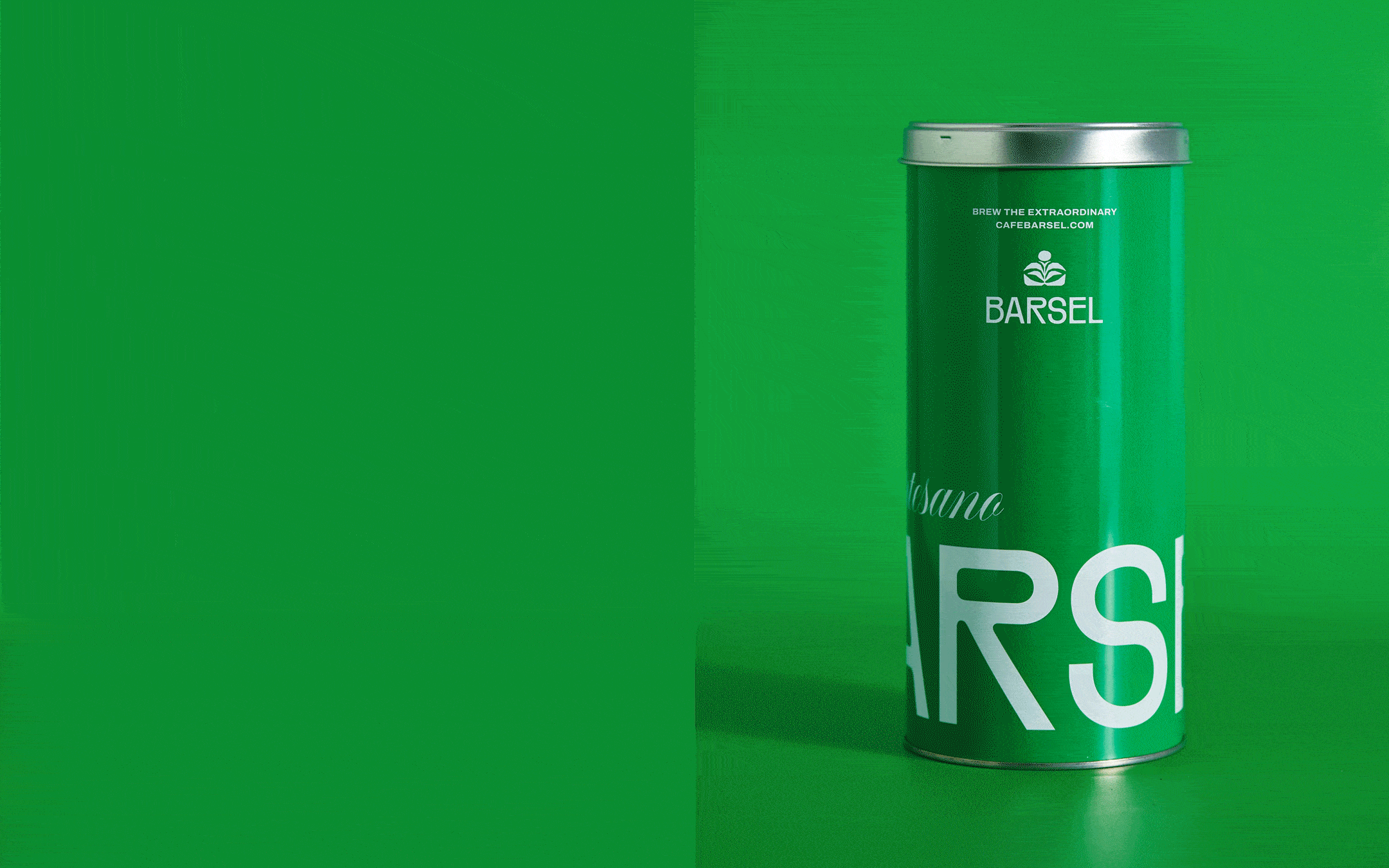
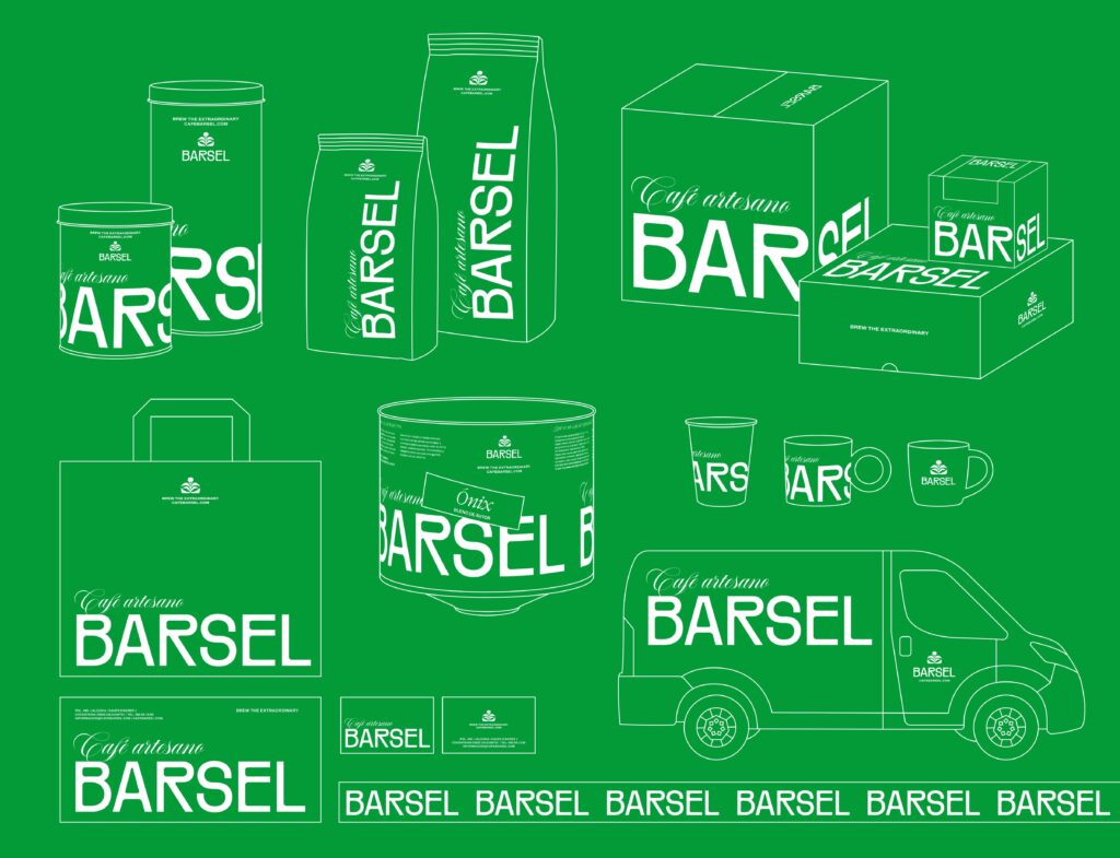
This new positioning was translated across every brand touchpoint, from professional and retail packaging to social media and the online store. As part of the rebrand, we developed a new packaging system capable of organizing the entire product portfolio while improving product identification on shelf. Through a colour-coded labeling system, each category was clearly differentiated, creating a more scalable and intuitive brand architecture.
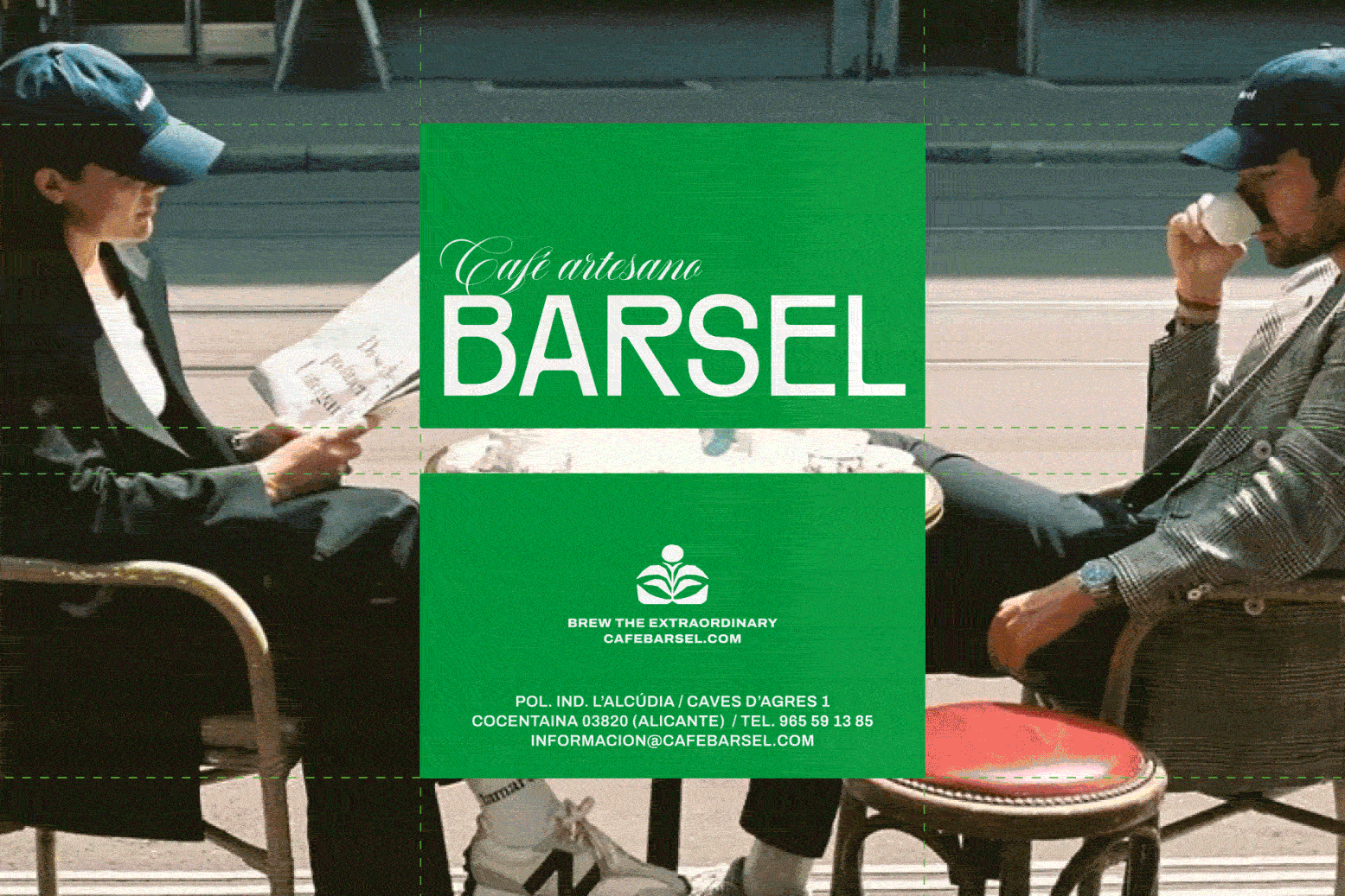
We also turned green into the brand’s primary visual asset. A distinctive colour capable of setting Barsel apart within the category while representing two key ideas behind the new strategy: creativity and traceability. The system is completed by a custom typographic identity, where subtle details add personality and reinforce the brand’s handcrafted character.
The result is a more coherent, recognizable and competitive brand. A brand capable of operating comfortably between the worlds of specialty coffee and conventional coffee, without giving up the qualities that have made it relevant for more than three decades.
Tell us what you need and we will contact you as soon as possible.