We want you to tell us about your project.
Tell us what you need and we will contact you as soon as possible.
Embrace Darkness
Step Into the Light
Cuéntanos qué necesitas y nos pondremos en contacto contigo lo antes posible.
|
|
Leer
?
Play
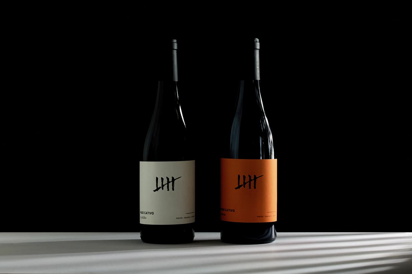
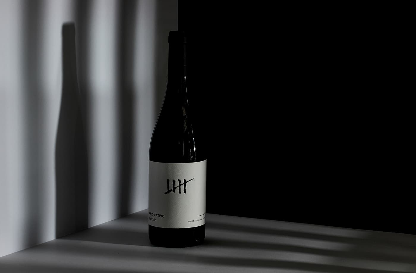
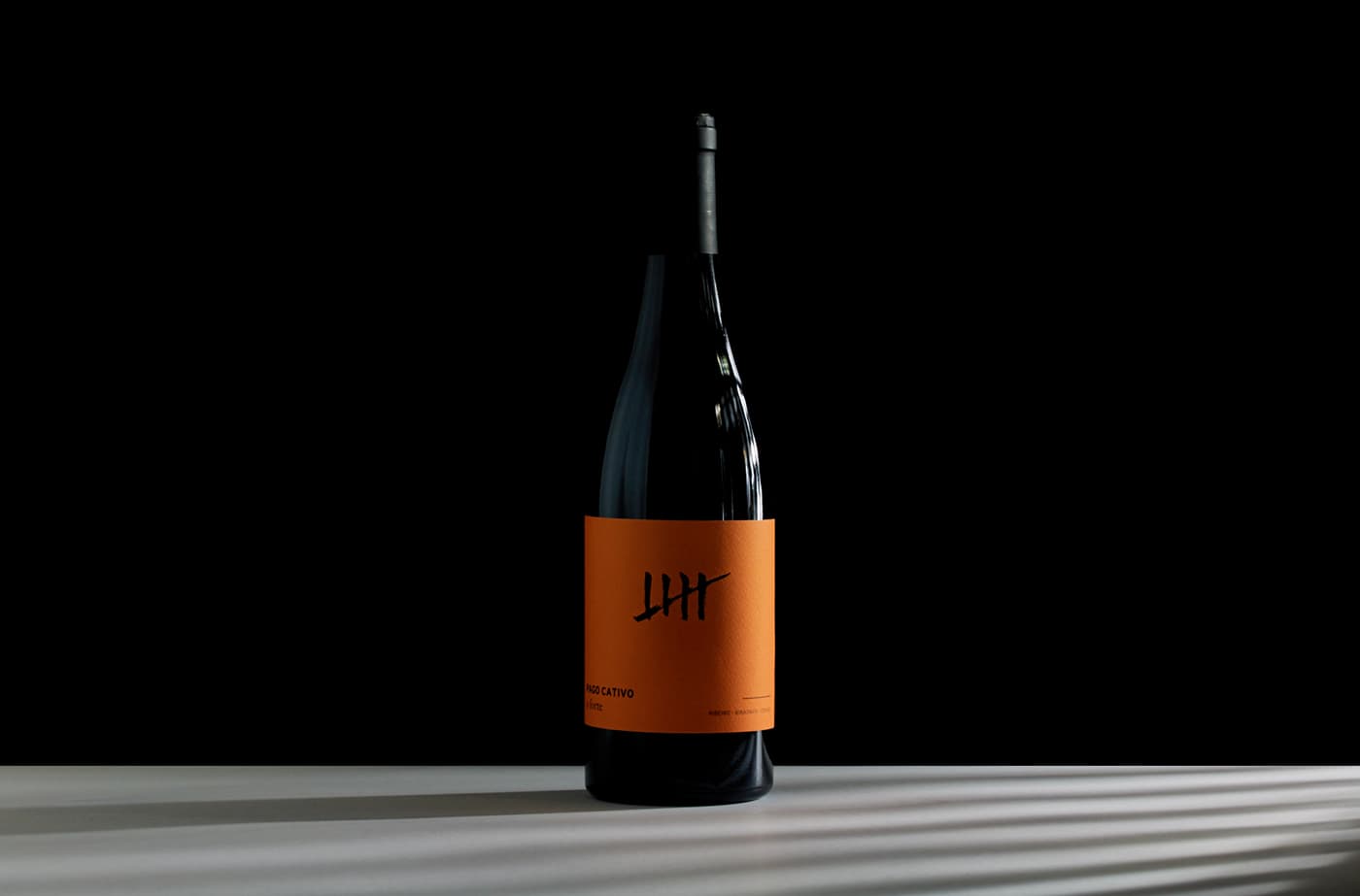
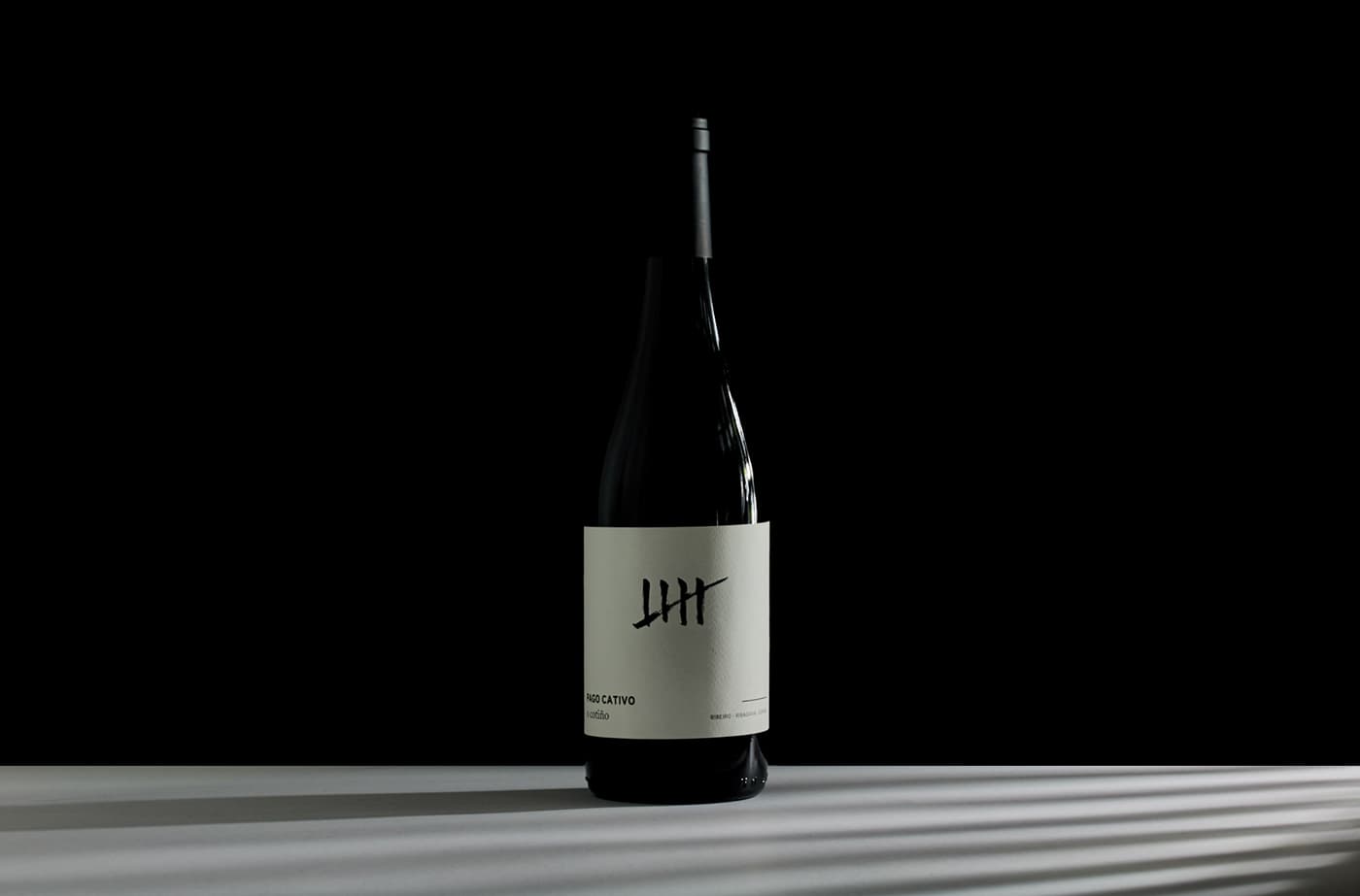
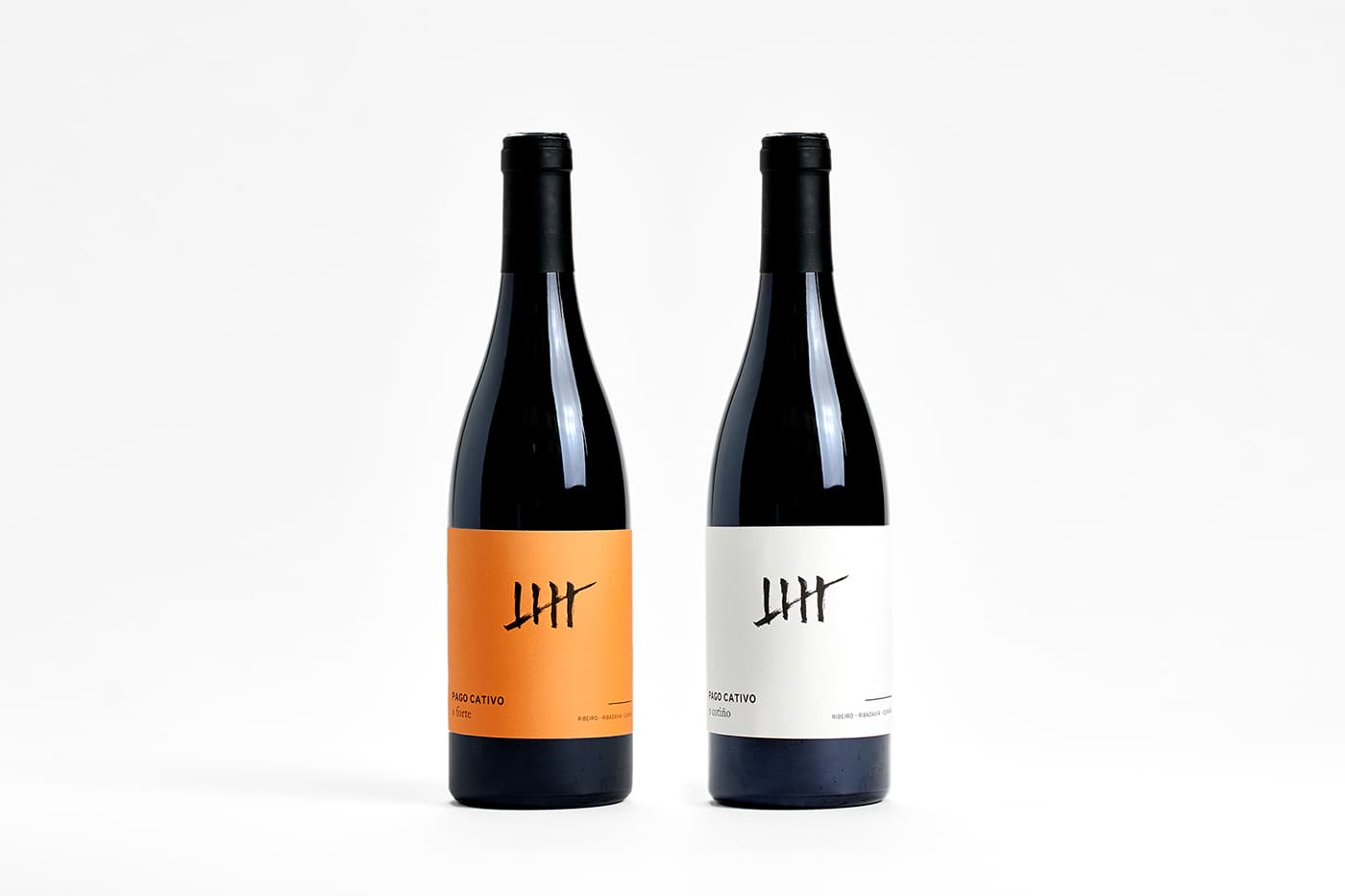
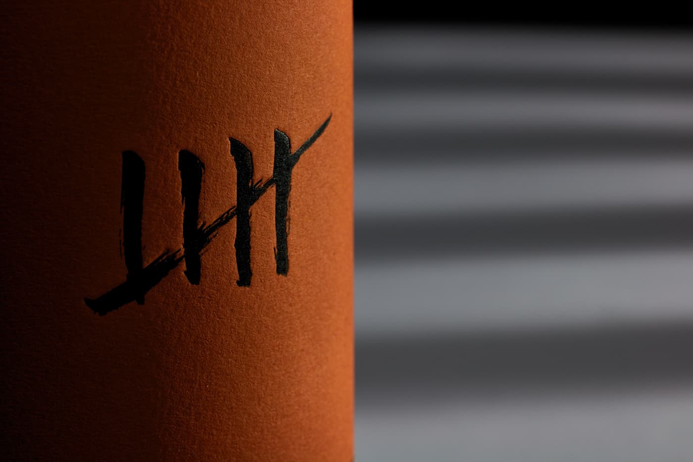
Wine label design by Alex Monzó.
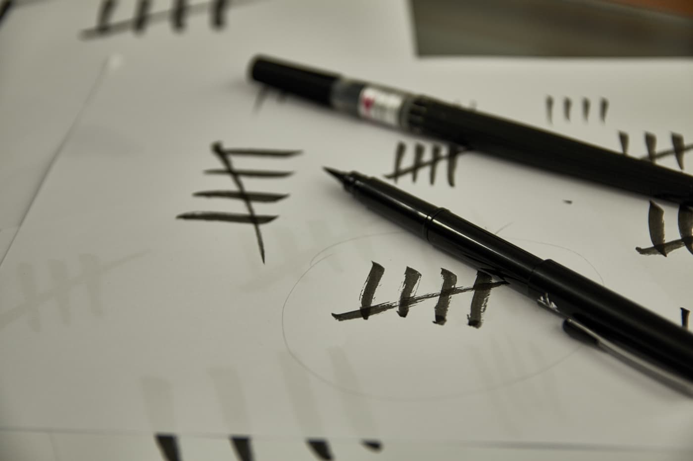
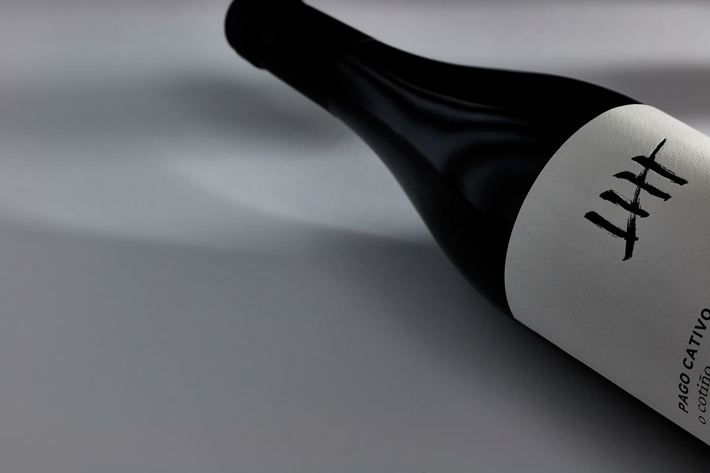
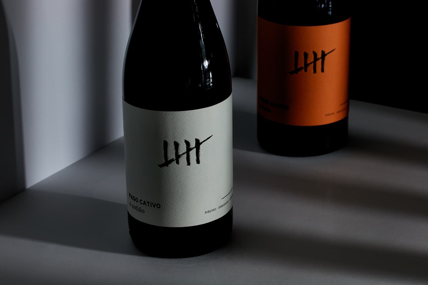
Simplicity and meaning define the image of Pago Cativo, a Spanish wine with two presentations: White O Forte and Tinto O Cotiño made by Brandsummit. The iconic design played on the name of the product. “Cativo” means “small” in Galician, the origin of the wine, but also “captive”, which is why one of the most emblematic elements of the prison was taken as the central image.
Finally, the design was captured on white and orange labels to differentiate each type of wine and highlight the color of the glass of each bottle. The type of paper used was Cotone Bianco Ultra WS from Manter. A simple, yet memorable design, with the main feature being an inverted thump.
Tell us what you need and we will contact you as soon as possible.