We want you to tell us about your project.
Tell us what you need and we will contact you as soon as possible.
Embrace Darkness
Step Into the Light
Cuéntanos qué necesitas y nos pondremos en contacto contigo lo antes posible.
|
|
Leer
?
Play
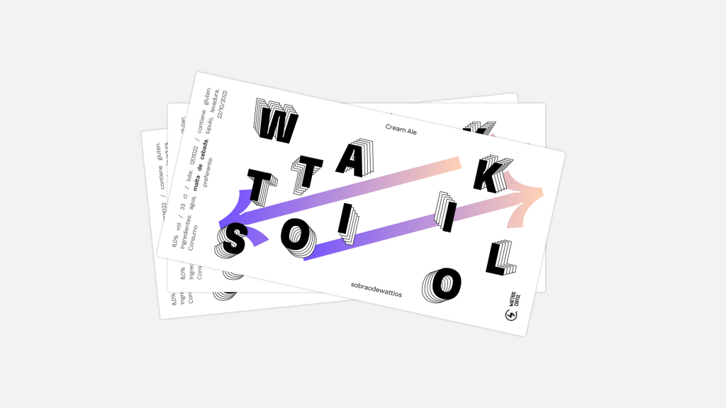
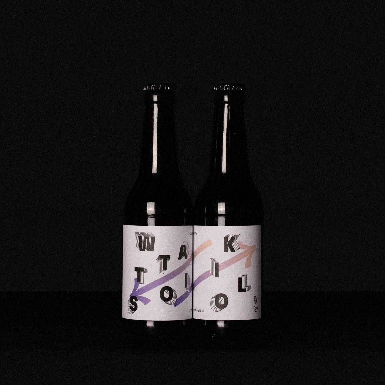
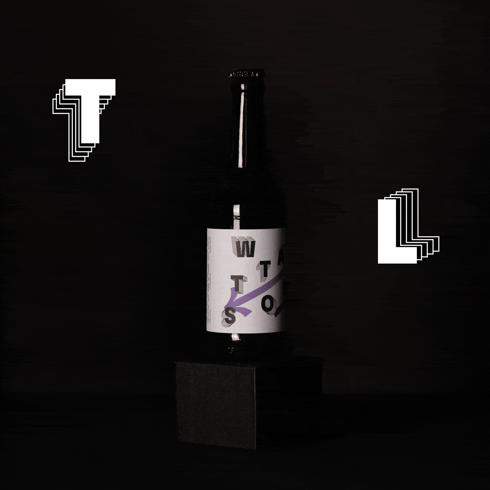
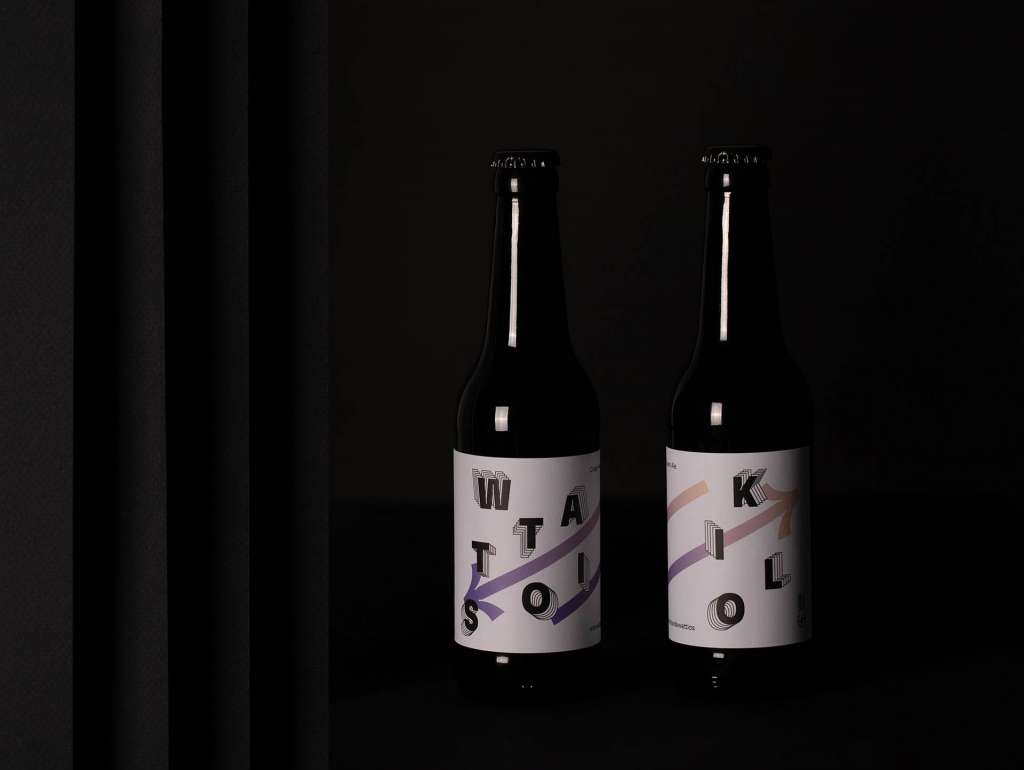
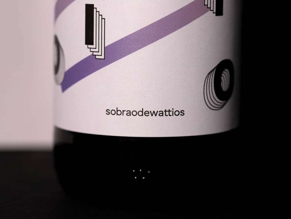
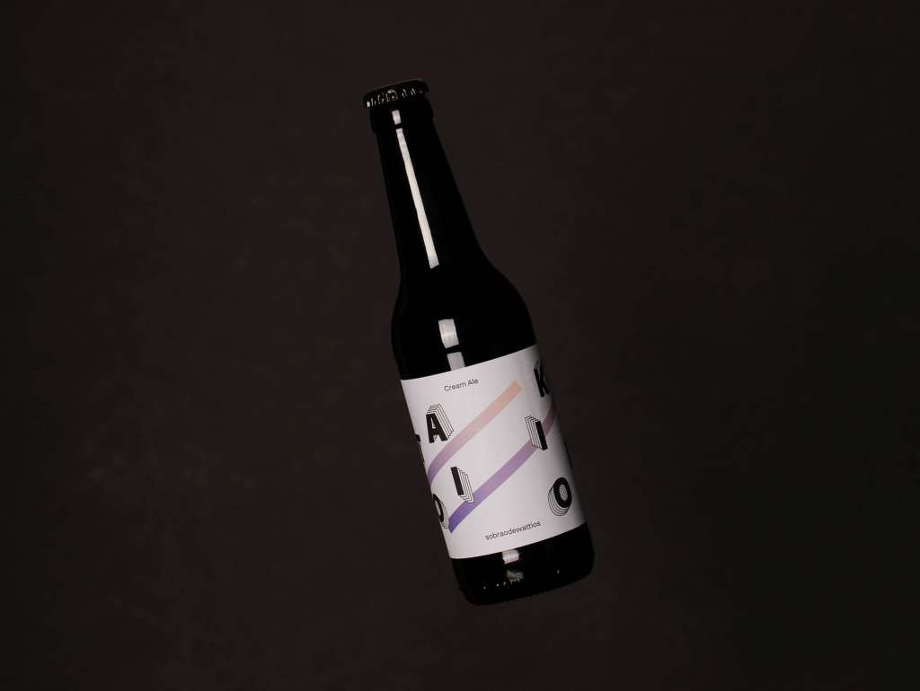
The label design for this “Wattio/Kilo”-centric beer uses contrast and kineticism to create a dynamic and engaging experience. Contrasting colours: white, black and a gradient were used to convey the energy of cycling.
The bold typography and repetitive shapes suggest movement and speed, further emphasising the active nature of cycling. It is an abstract and modern design that conveys a sense of movement and energy that seeks to appeal to both cyclists and beer lovers.
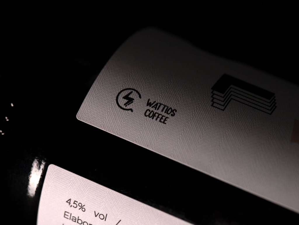
Behind this bottle there’s more than just a sip. Created by Brandsummit for Wattios Coffee.
Do you have a project in hand? At Brandsummit we are a strategic design studio located in Valencia (España). We are specialized in branding, packaging, interior and digital design for food and beverage brands, and we have our own methodology, worked on and in constant evolution since 2014.
If you want to contact us and send us your idea, write to: hola@brandsummit.es
Tell us what you need and we will contact you as soon as possible.