We want you to tell us about your project.
Tell us what you need and we will contact you as soon as possible.
Embrace Darkness
Step Into the Light
Cuéntanos qué necesitas y nos pondremos en contacto contigo lo antes posible.
|
|
Leer
?
Play

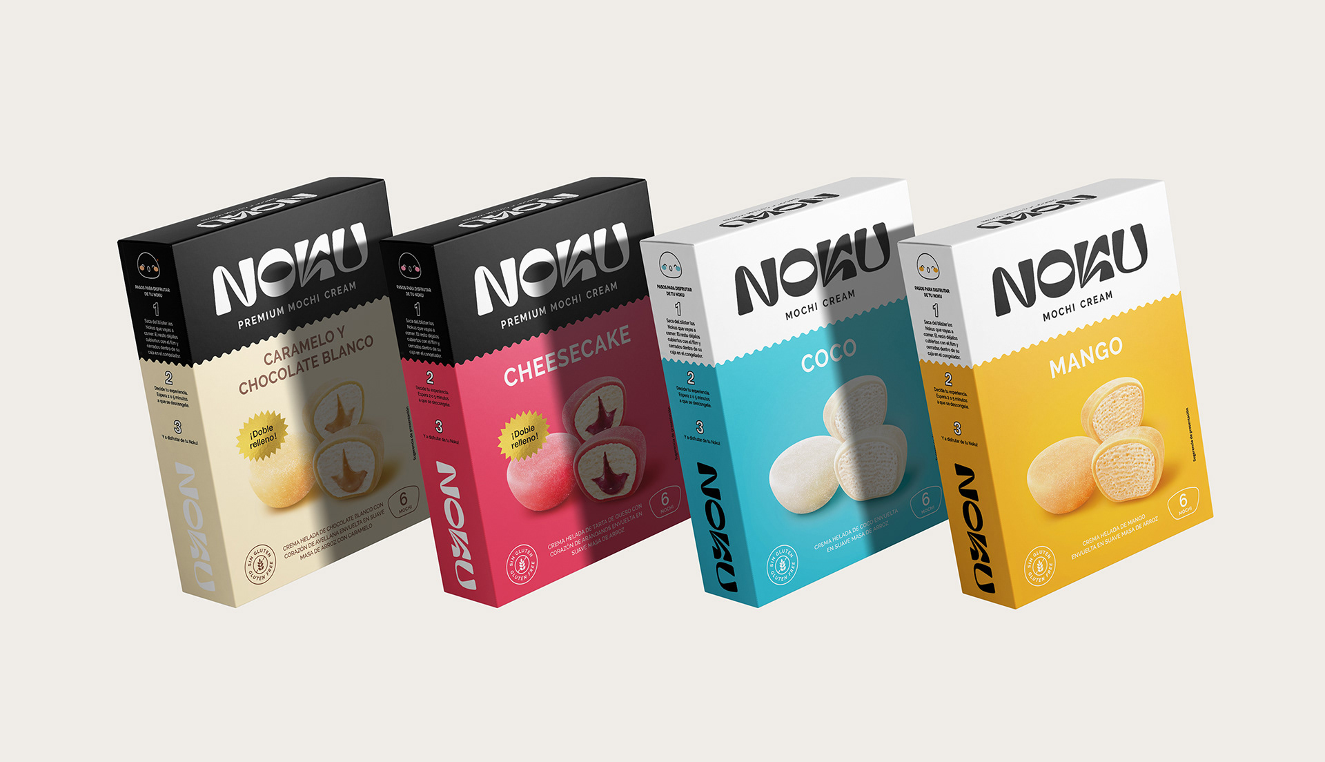
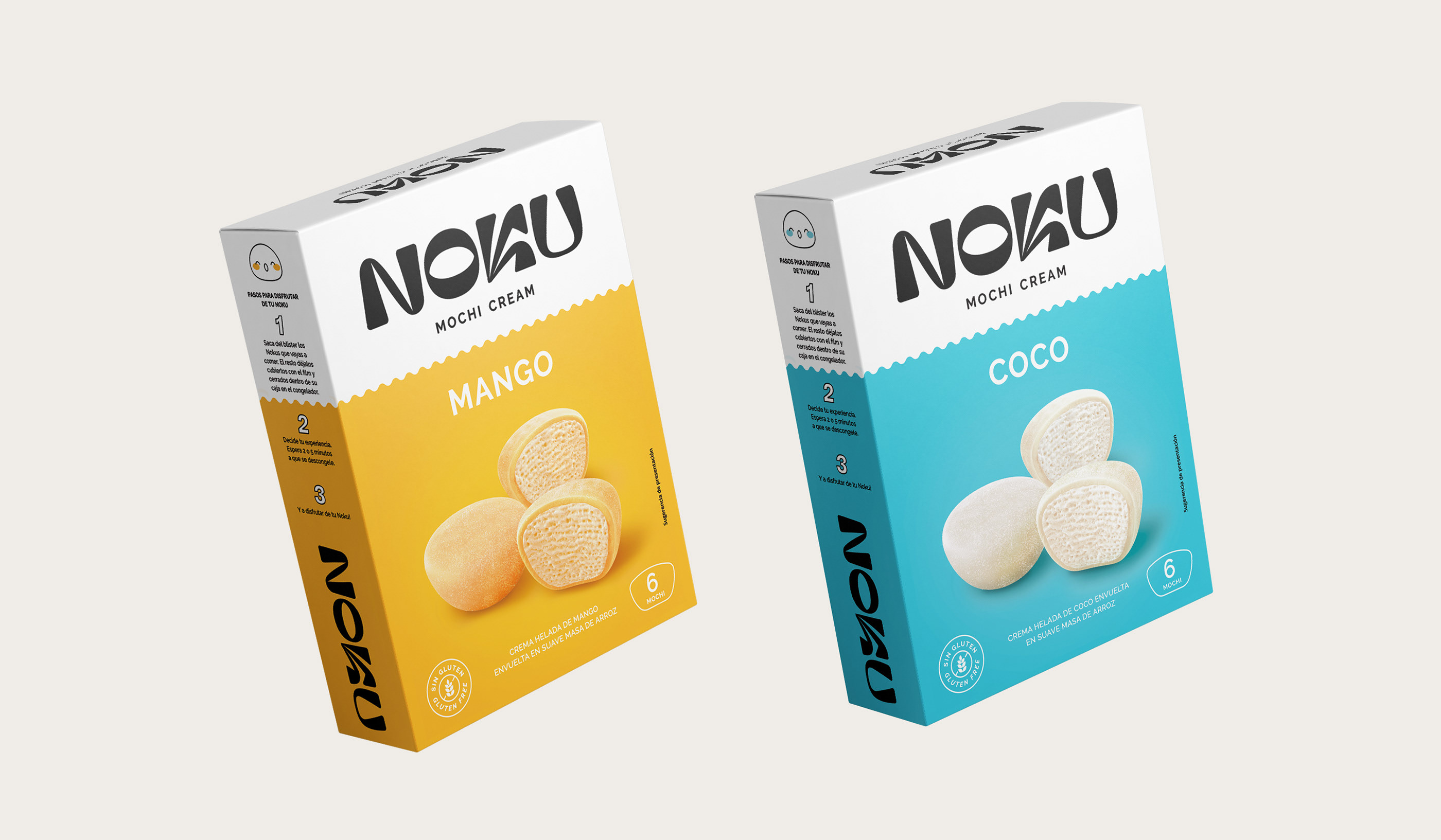
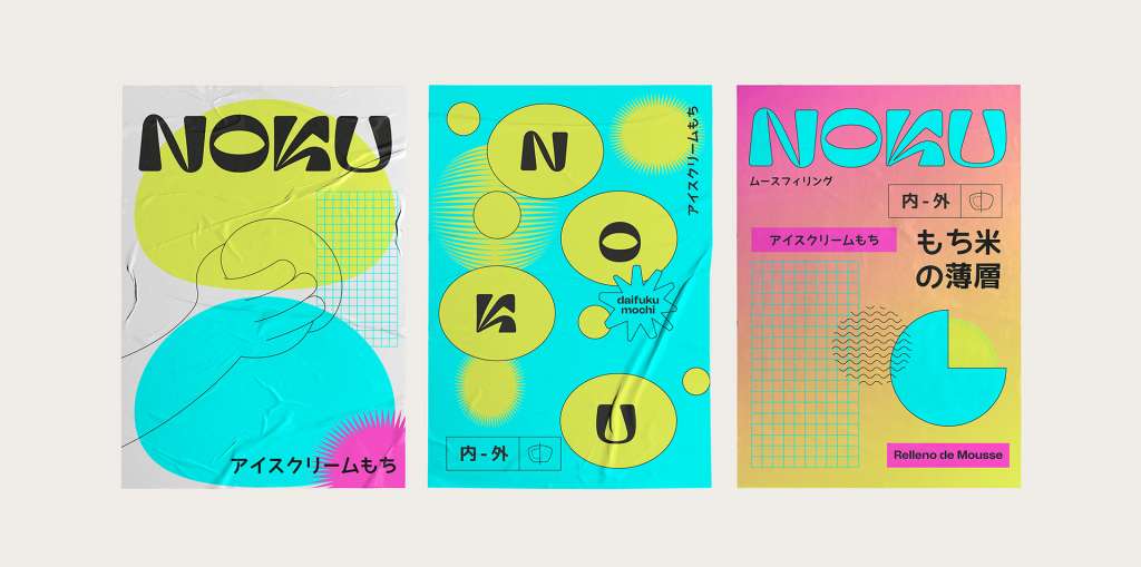
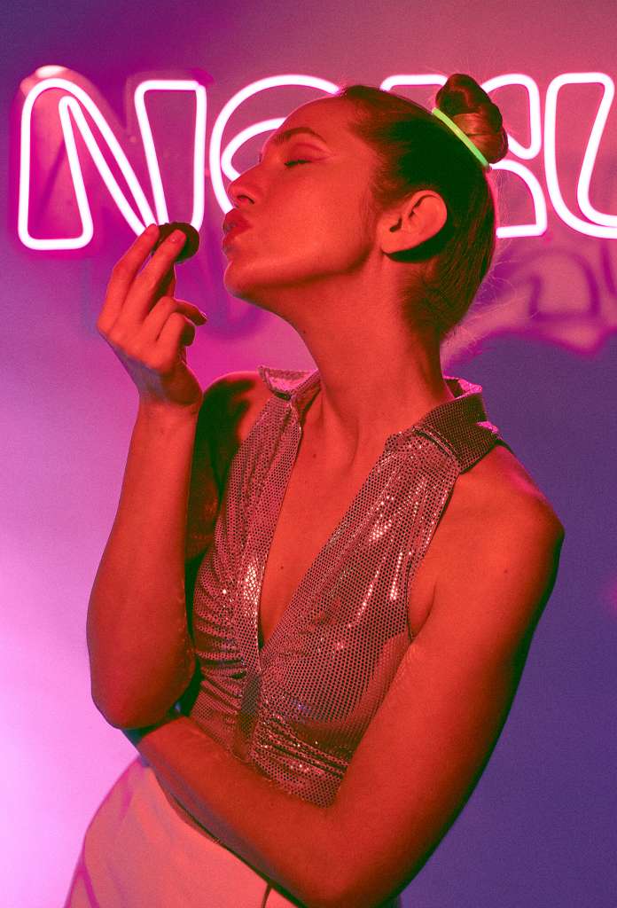
Noku brand design by Brandsummit.
Noku is as irresistible on the outside as it is on the inside, a new brand where we developed the concept, naming, verbal identity, visual identity and packaging.
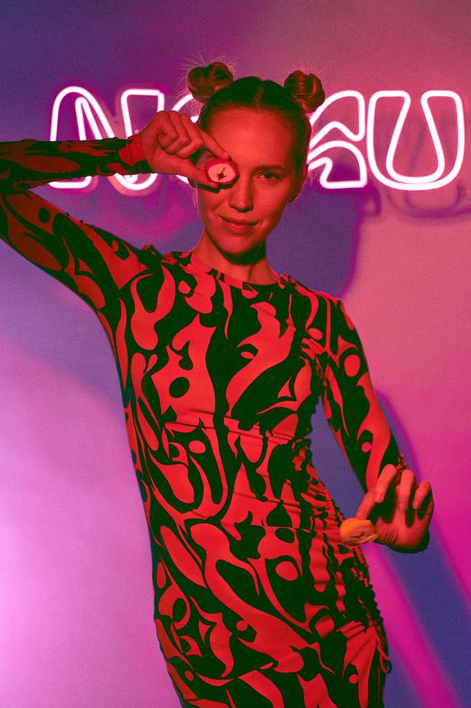
We are facing a brand with a mentality without barriers, which moves away from the purist and invites inclusion. A proposal in which everything and everyone can be welcome, letting out our most daring side. The one who is not afraid of giving himself up to an addictive experience, who is committed to pleasure and who is capable of (r)evolving the way of seeing the world.
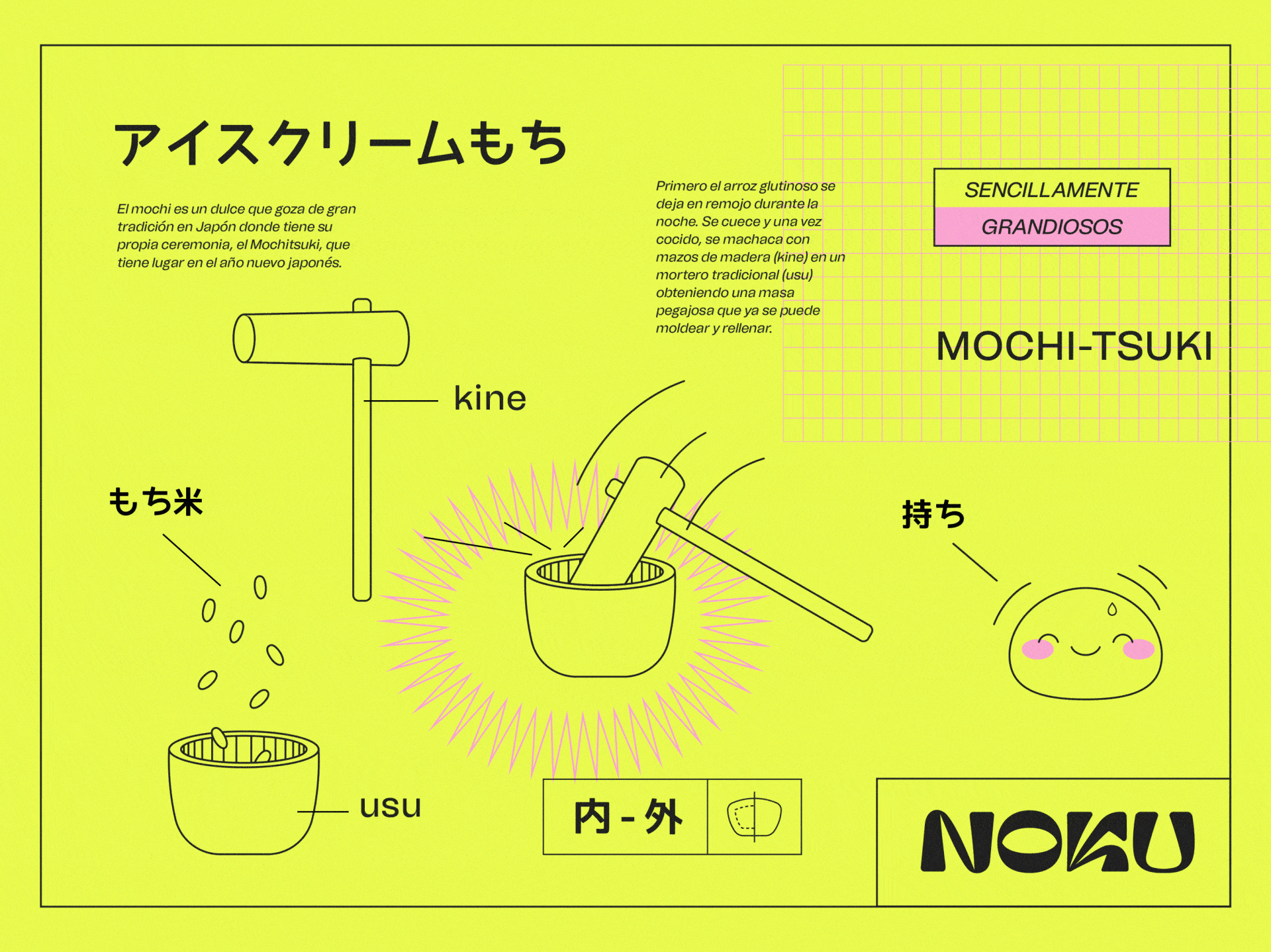
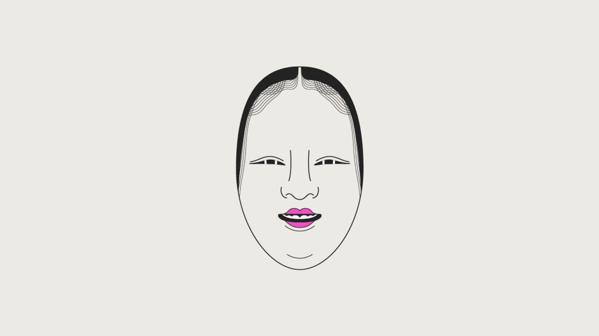
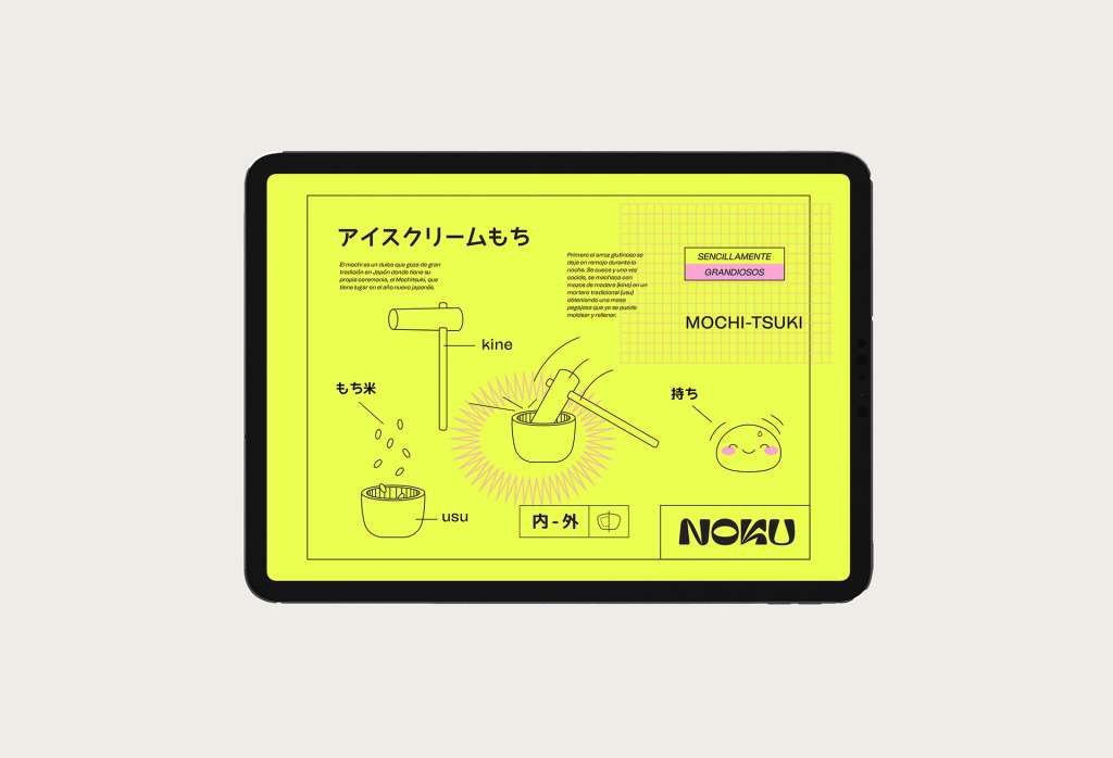
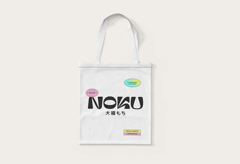
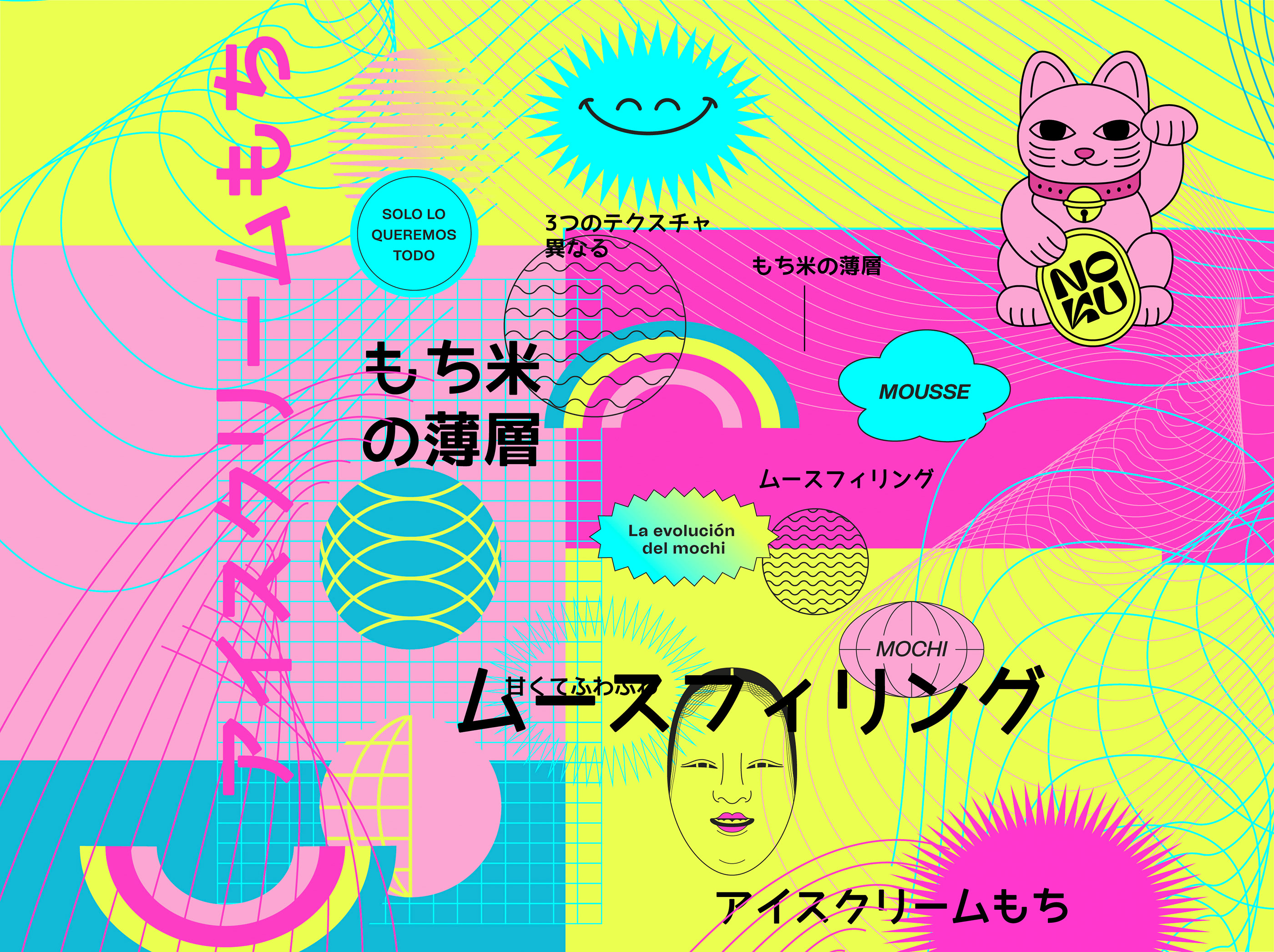
Thus, we take the Uchi-Soto social concept, which in Japanese is understood as “inside-outside” and is related to the duality of “public-private” or “group-individual” in the Japanese country.
We look for a name as irresistible as the product: daring, pleasant, inclusive, colourful, practical and diverse. We arrive at Noku, marked by its sonority and relevant tone, easy to read and remember. In addition, we create your communication strategy and tone, a unique way of speaking totally anchored to your brand and business strategy.
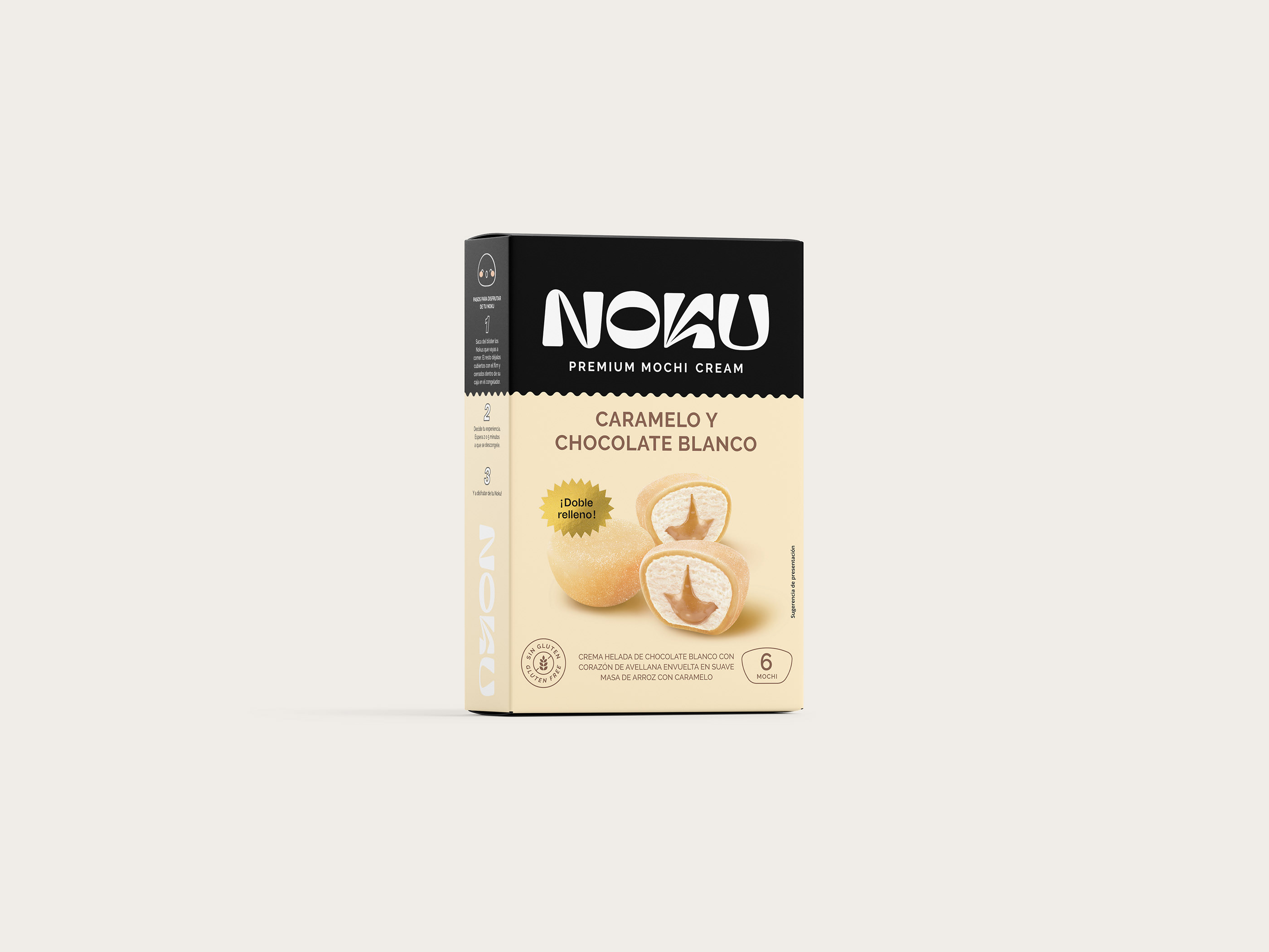
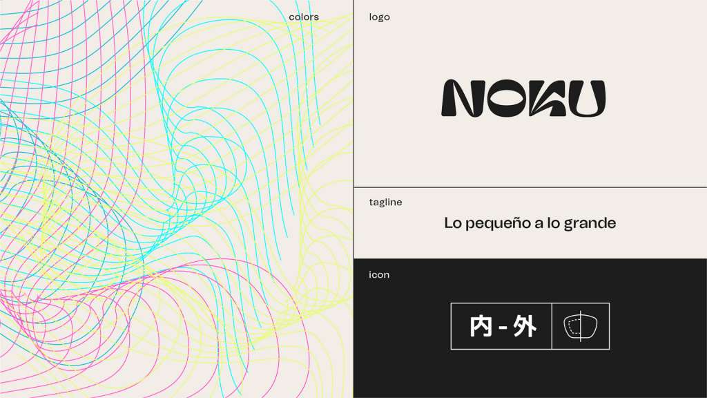
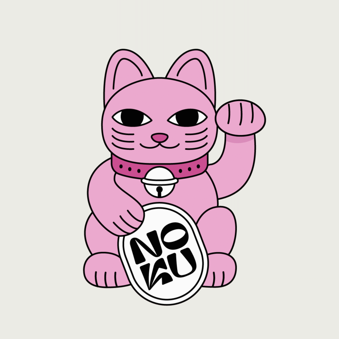
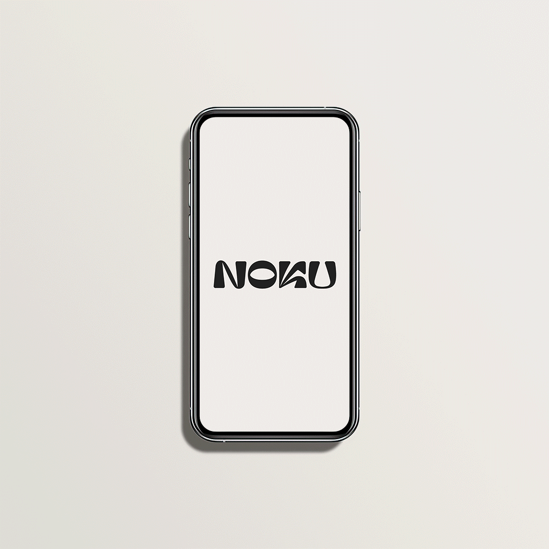
We needed a logo that reflected that duality, modern and traditional at the same time, tender as a mochi, but sharp as a katana, impressive and elegant. We created a totally unique and personalized logo following the uchi-soto concept, with shapes reminiscent of Japanese characters and with a contrast of soft and sharp shapes.
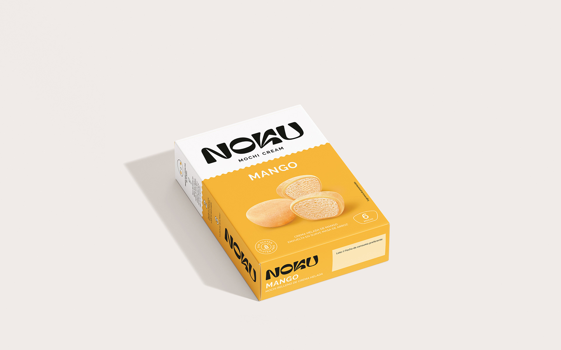
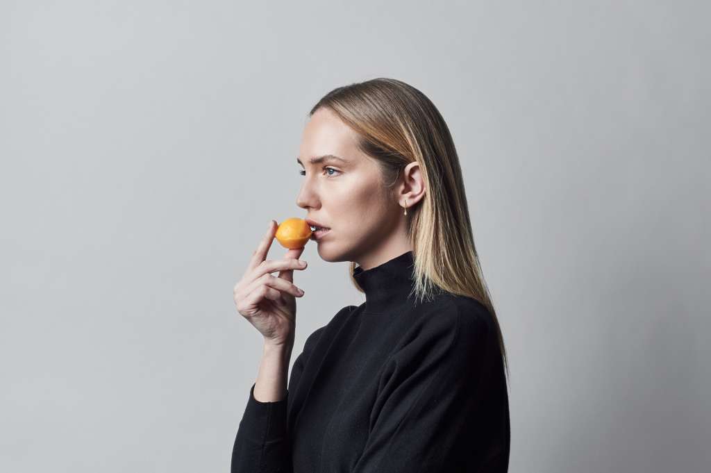
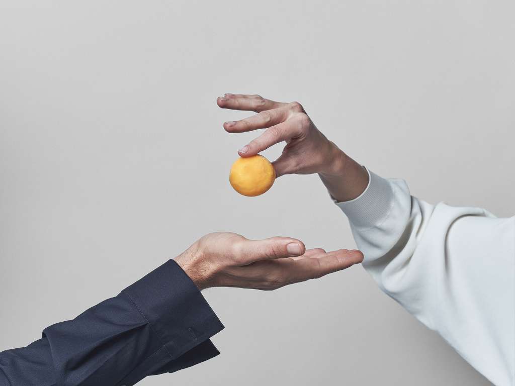
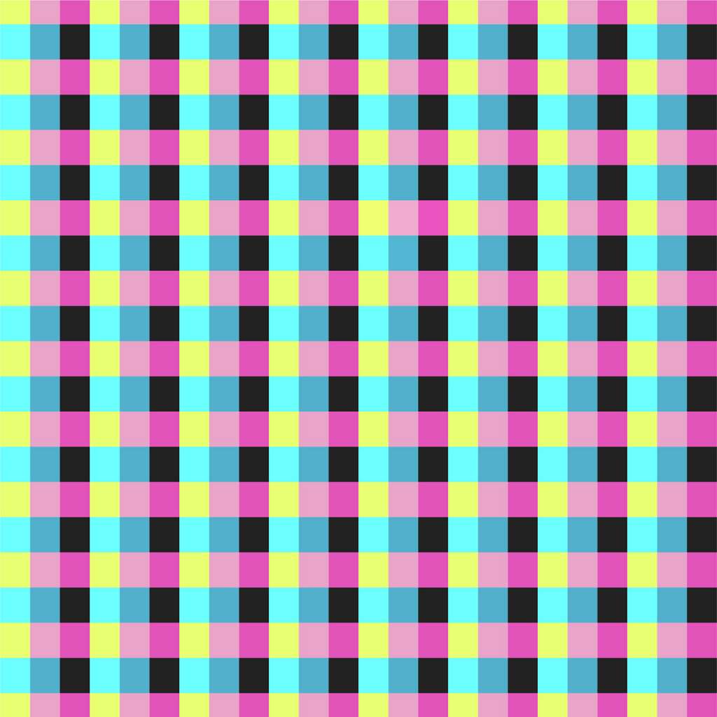
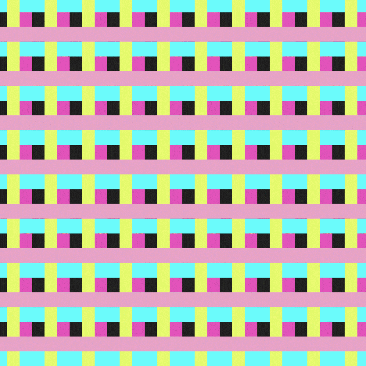
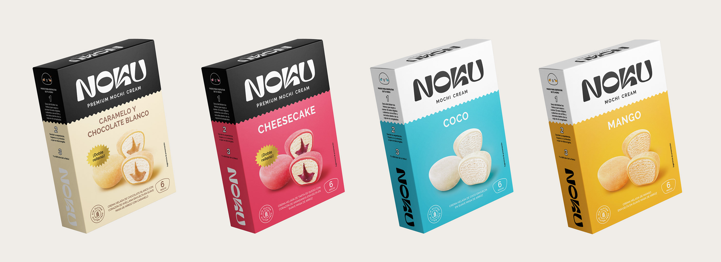
Its diversity as a product is reflected in its commitment to vibrant colors, the contrast of its textures (cover and filling), its exotic origin and the explosion of flavor it leaves in the mouth.
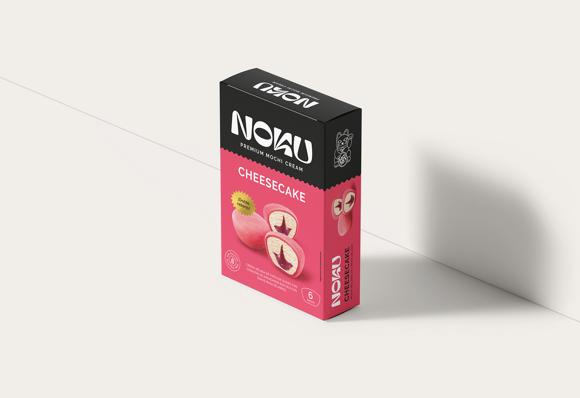
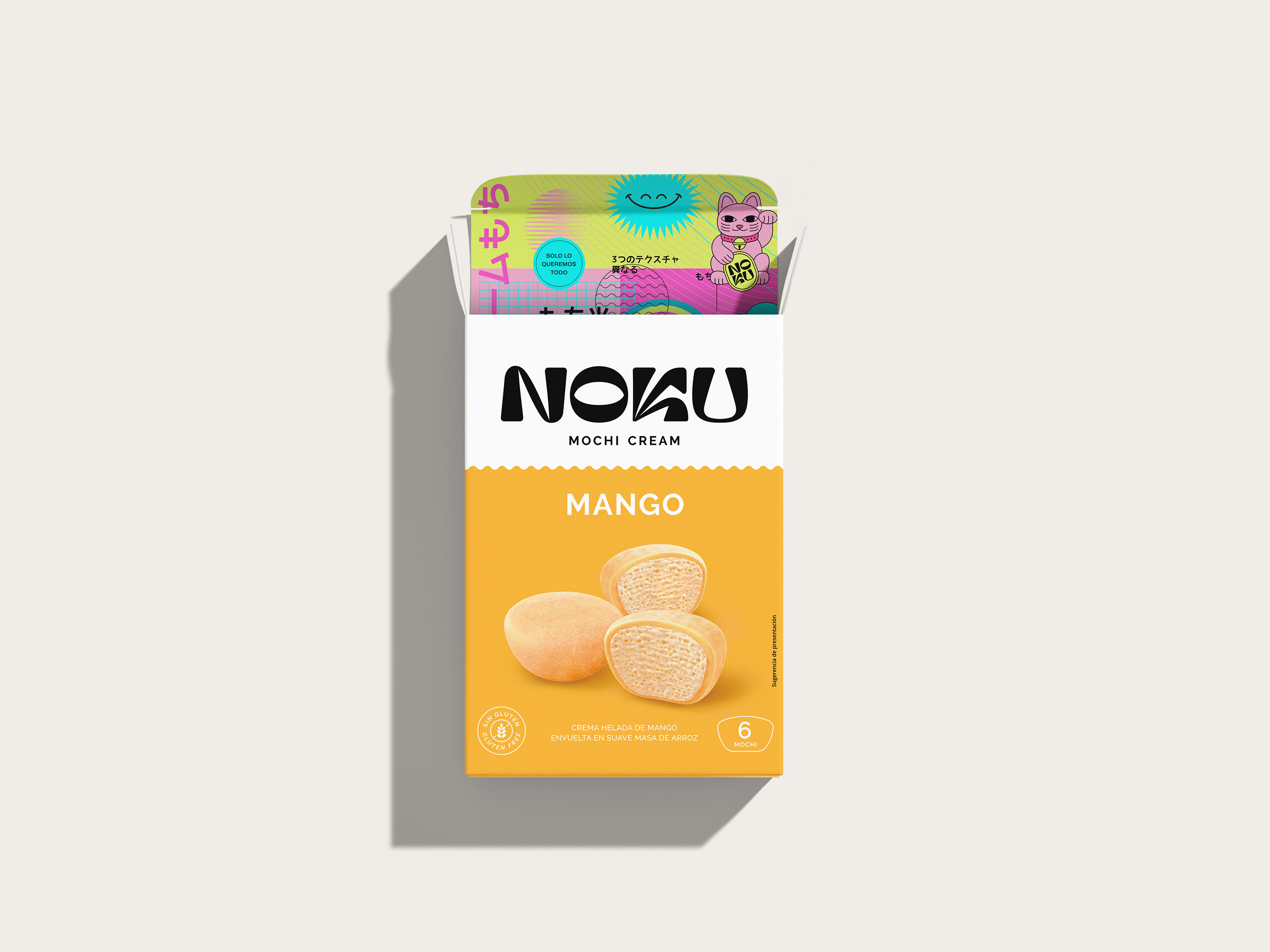
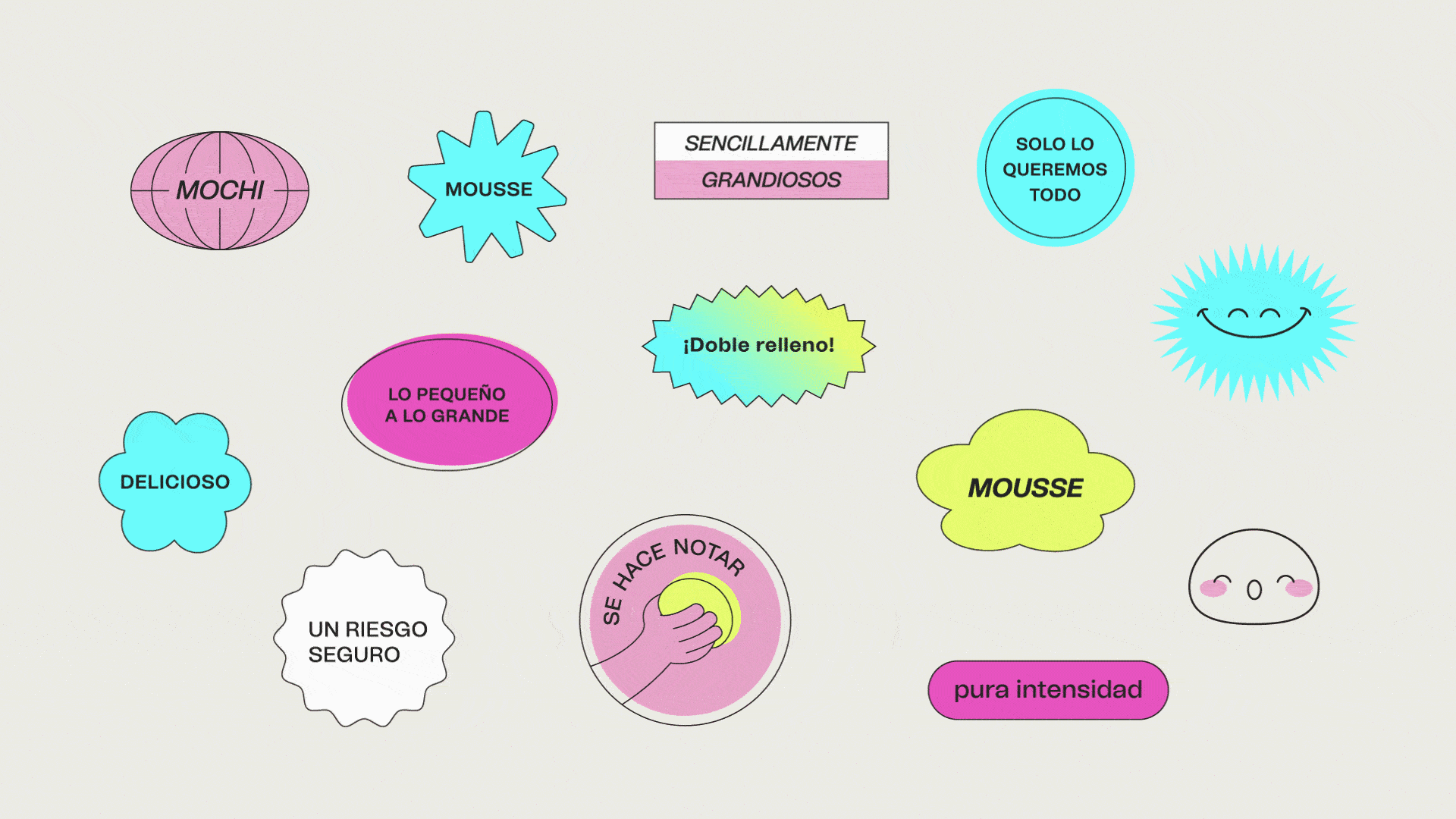
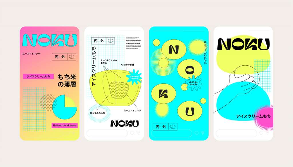
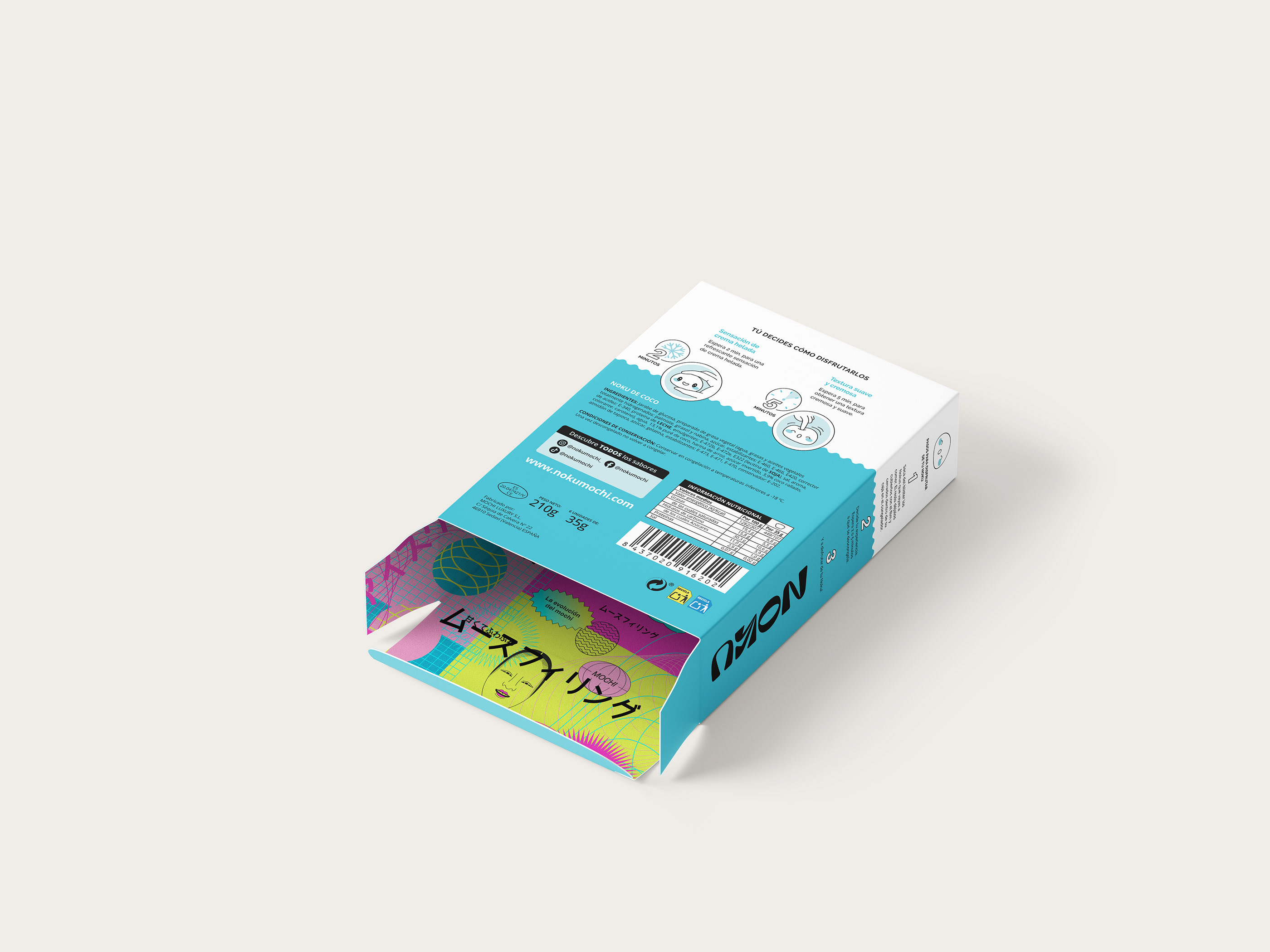
In addition to the logo and colors, a series of icons and illustrations were created to support the brand, both in packaging and in communication.
We work on the duality of the uchi-soto brand concept, dividing the container into two clearly differentiated areas, one in a single color with the brand as the main element, and another in full color, with renders of the product made ad-hoc for the brand and with the color as the protagonist of the flavor to create differentiation on the shelf.
Noku is a bid for risk and indulgence. For believing that life should be seen from curiosity, exploring and looking for what allows us to be independent and live life without complications, in a practical but intense way.


Tell us what you need and we will contact you as soon as possible.